Action list
Action list is a vertical list of interactive actions or options. It's composed of items presented in a consistent. single-column format, with room for icons, descriptions, side information, and other rich visuals.
On this page
On this page
Overview
Action lists can have many applications:
- They’re the foundation of menus, selection panels, and other overlay components
- They can be applied to page sidebars for showing individual actions, handling local navigation, and displaying metadata
Action lists support section dividers and headers for grouping items, and individual item dividers for added clarity.
Action lists use a mobile-friendly inset style. Their sizes are adapted on touch devices, and their single-column format should render consistently in any screen size.
Items in an action list are generally interactive, and respond visually to hover, active, and focus states. Disabled and read-only items are also supported.
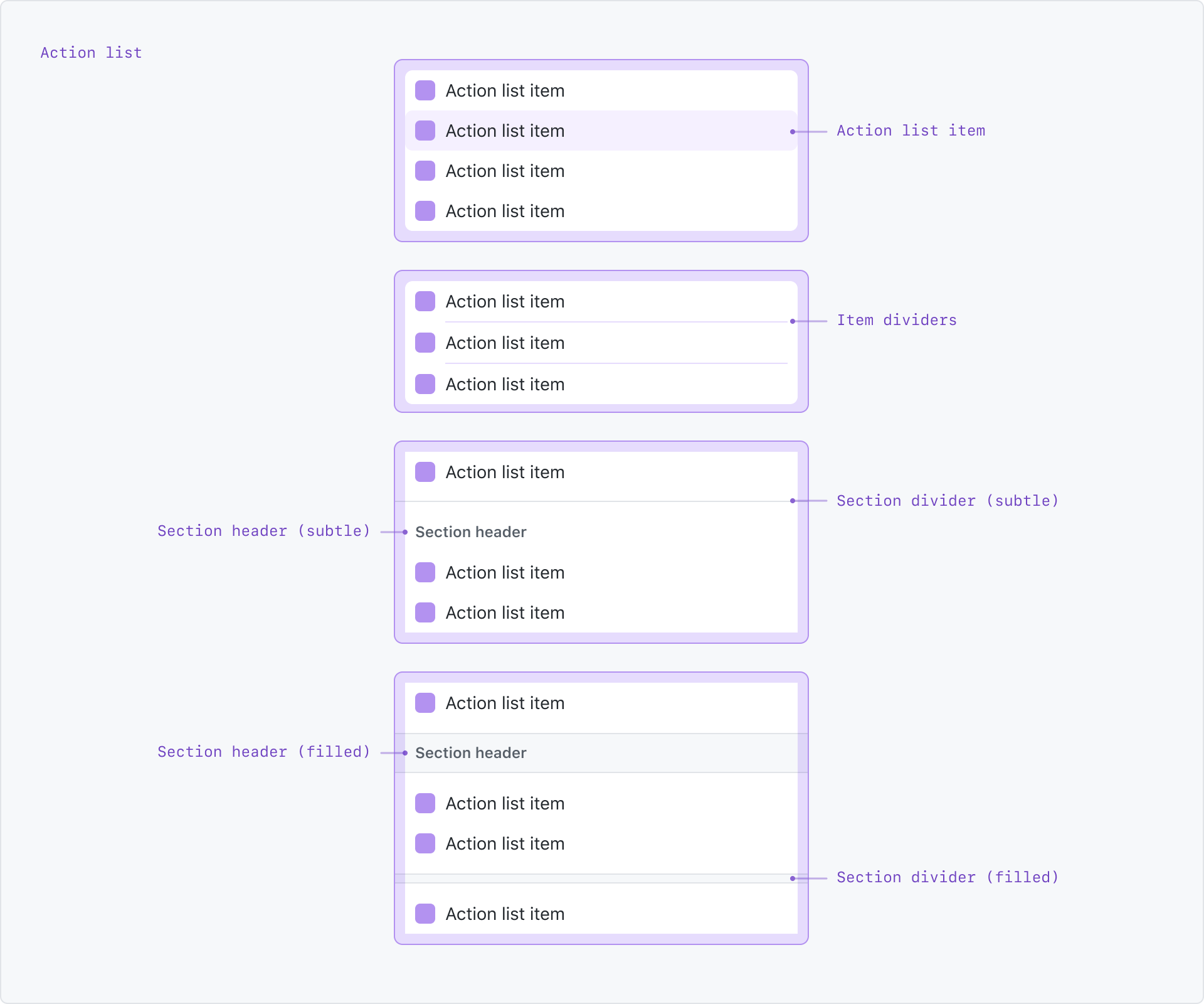
Anatomy
An action list can be composed of:
- Action list items
- Item dividers
- Section headers (subtle or filled styles)
- Section dividers (subtle or filled styles)
Options
Sizes
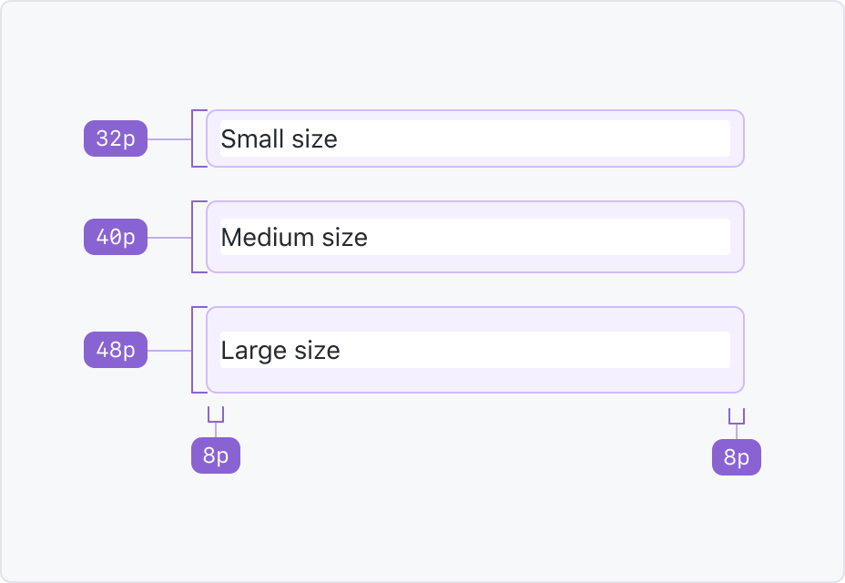
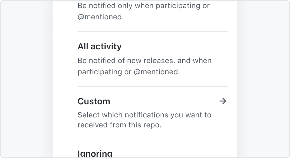
Action list items support three different sizes: small, medium, and large. The small size is the default and most common option. Medium sizes work well for relaxed local navigation, while large sizes can support items that need more breathing room.
Sizes only grow vertically. This behavior keeps the content aligned among items, and retains horizontal space for density.
On touch devices, the large size is used at all times to ensure usability when tapping.
Be cautious when mixing different sizes in the same list to avoid inconsistency.
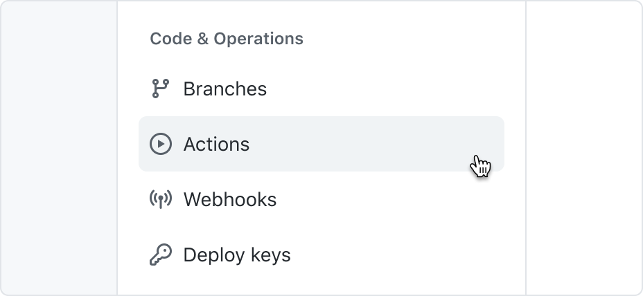
Use leading visuals to represent system sections, features, or options.
Use leading visuals in important menu items.
Use leading visuals to represent content types.
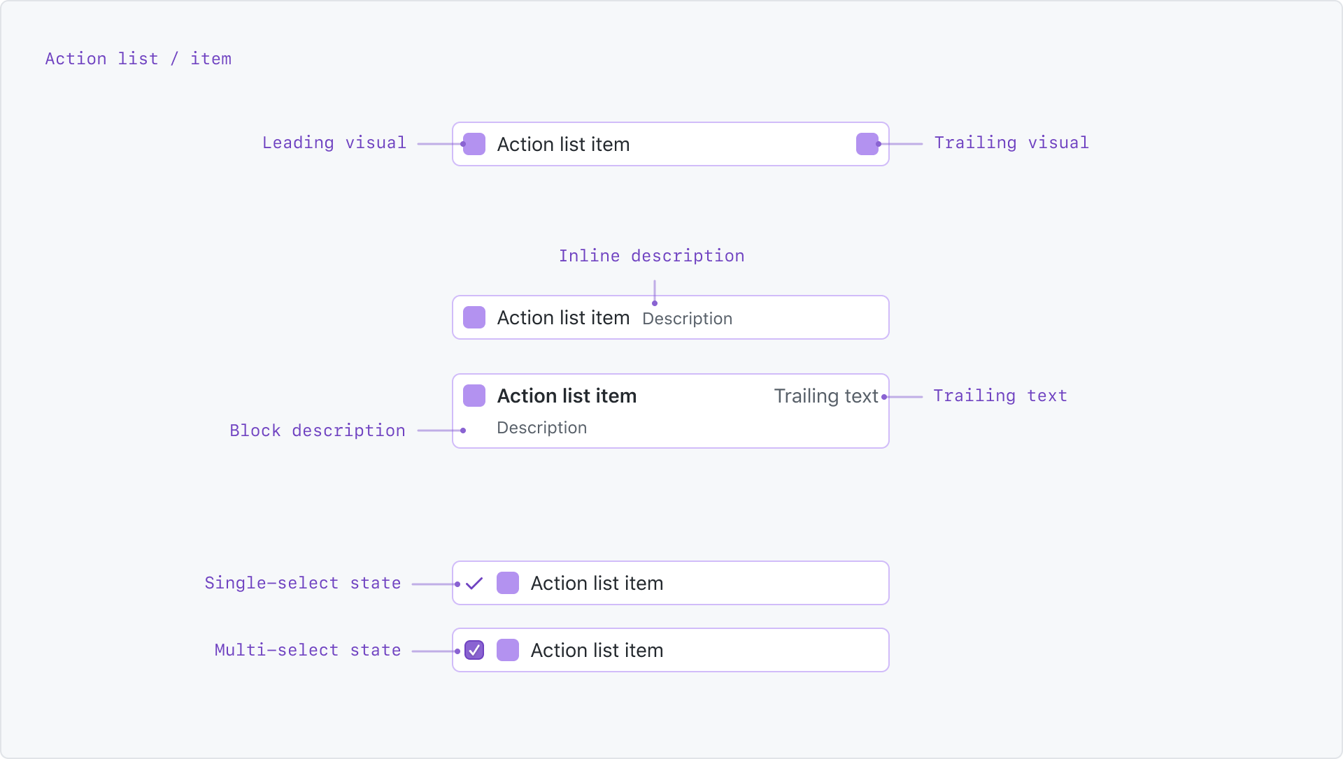
Leading visual
Leading visuals are optional and appear at the start of an item. They can be octicons, avatars, and other custom visuals that fit a small area.
When listing system sections, features, or options, use leading visuals to improve the items' scannability. In user-generated objects, they can help to indicate the item's content type and status.
Depending on the context, displaying a leading visual may not be necessary. For example, a list of branches in a select panel may not need repeated icons if the surrounding UI provides enough hints about its content type.
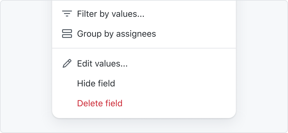
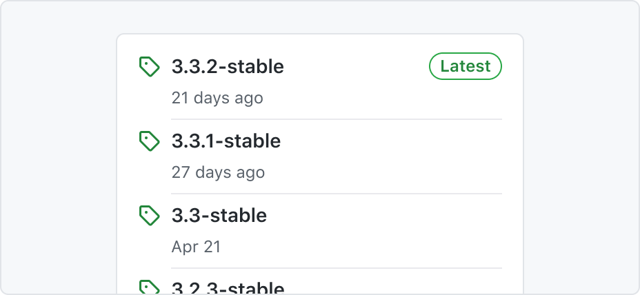
A right arrow as a trailing visual indicates there are more options to choose after selecting an item.
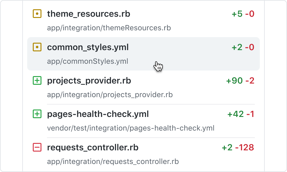
Trailing text with custom styling to indicate diff change.
Trailing visual and trailing text
Trailing visual and trailing text can display auxiliary information. They're placed at the right of the item, and can denote status, keyboard shortcuts, or be used to set expectations about what the action does.
Note these side visuals don't have dedicated interaction targets.
Use an arrow-right octicon in menus to indicate the action will open more options, such as in a nested context. Use a pencil octicon to indicate the item is going to be edited after clicking it.
Custom trailing elements are supported, such as counters, labels, and other custom visuals that may help identify the item.
When using a trailing text for displaying keyboard shortcuts, always confirm the characters match with the user's operating system. For example, to indicate a bold action in a Markdown toolbar, use "Ctrl+B" on Linux and Windows, and "⌘B" on Mac. See reference for Mac keyboard glyphs.
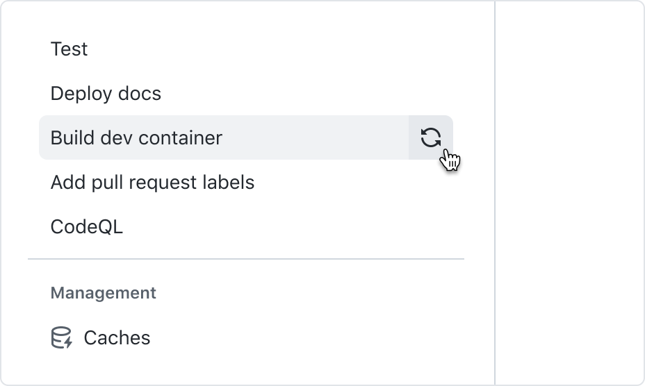
Trailing actions
Trailing action buttons can be used to present a secondary interaction related to the contents of the main item, such as opening a menu or dialog. They may appear when an item is hovered, and can be keyboard focused individually.
Item dividers
Item dividers allow users to parse heavier amounts of information. They're placed between items and are useful in complex lists, particularly when descriptions or multi-line text is present.
When considering whether to use item dividers, make sure they truly make the presented information easier to parse, instead of only increasing visual clutter.
When using item dividers, increasing the action list item size may also help with legibility.
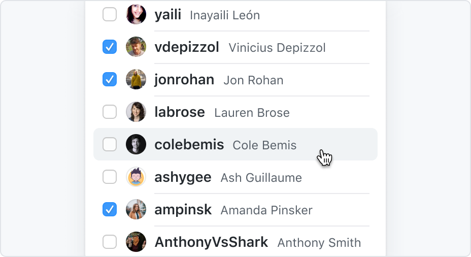
Selection states
Action list items can be selected. Single selections are represented with a check octicon, while multiple selections are represented with a checkbox component. These selection visuals are always placed at the beginning of the item.
When listing selectable items alongside non-selectable items in a menu, use dividers to differentiate between the item types.
Don't mix different types of selections in the same list.
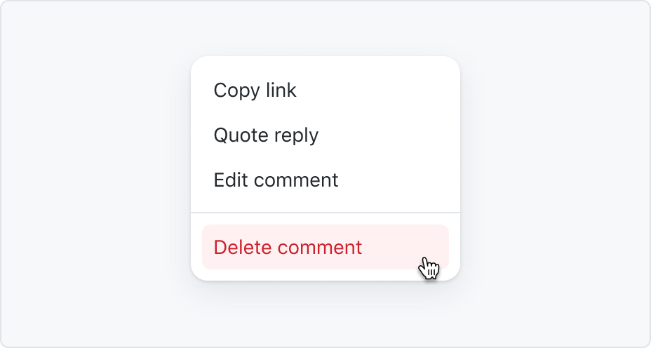
Danger items
An action list item can have a special "danger" style, to be used in cases that require extra attention from the user.
For destructive or irremediable actions, show a confirmation dialog for extra friction. If the action is not destructive, present the user a way to undo the action instead of asking for confirmation. Never use a warning when you mean undo.
Place danger items at the end of the list.
Application
In overlays

Action menu
Action menus are used for disambiguation, navigation, or to display secondary options. They appear when users interact with buttons, actions, or other controls.
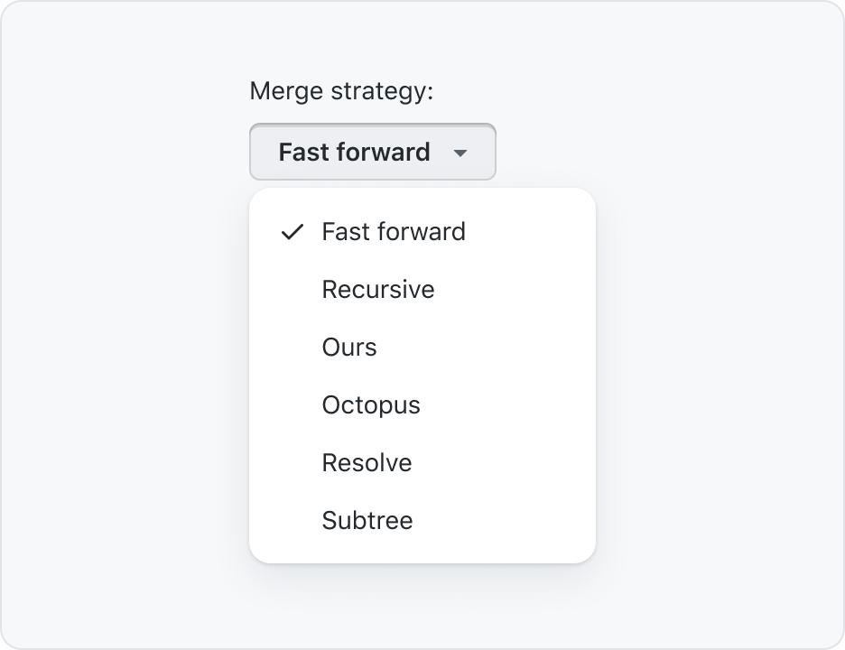
Action menu with selection
ActionMenu can be used for making a single selection among a small list of options. The list is usually predefined with system values, but in some cases it can include user-provided data when those are known not to grow into too many items.
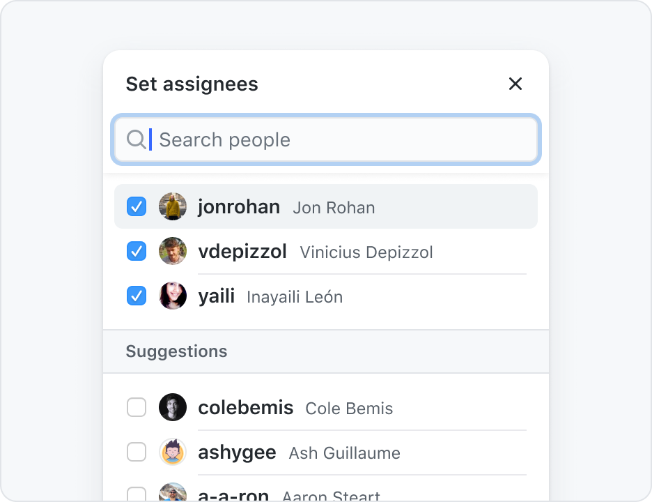
Select panel
Select panels allow manipulating long lists of options, with filtering and other advanced interactions. They can be used for single or multi-selection.