On this page
Color
Get started
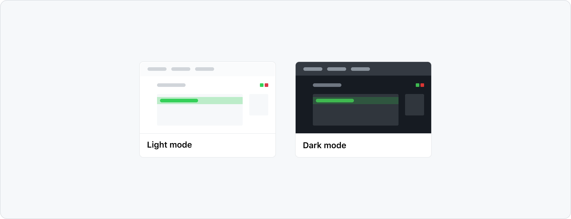
GitHub's UI offers a variety of different color modes. Every pattern in Primer is built to work across all color modes out of the box.
When designing product interfaces in Figma, we recommend using light mode. This is best because the Primer Figma components are only available in light mode. To preview your work in other modes, use the Figma color mode plugin.
How to use color for product UI
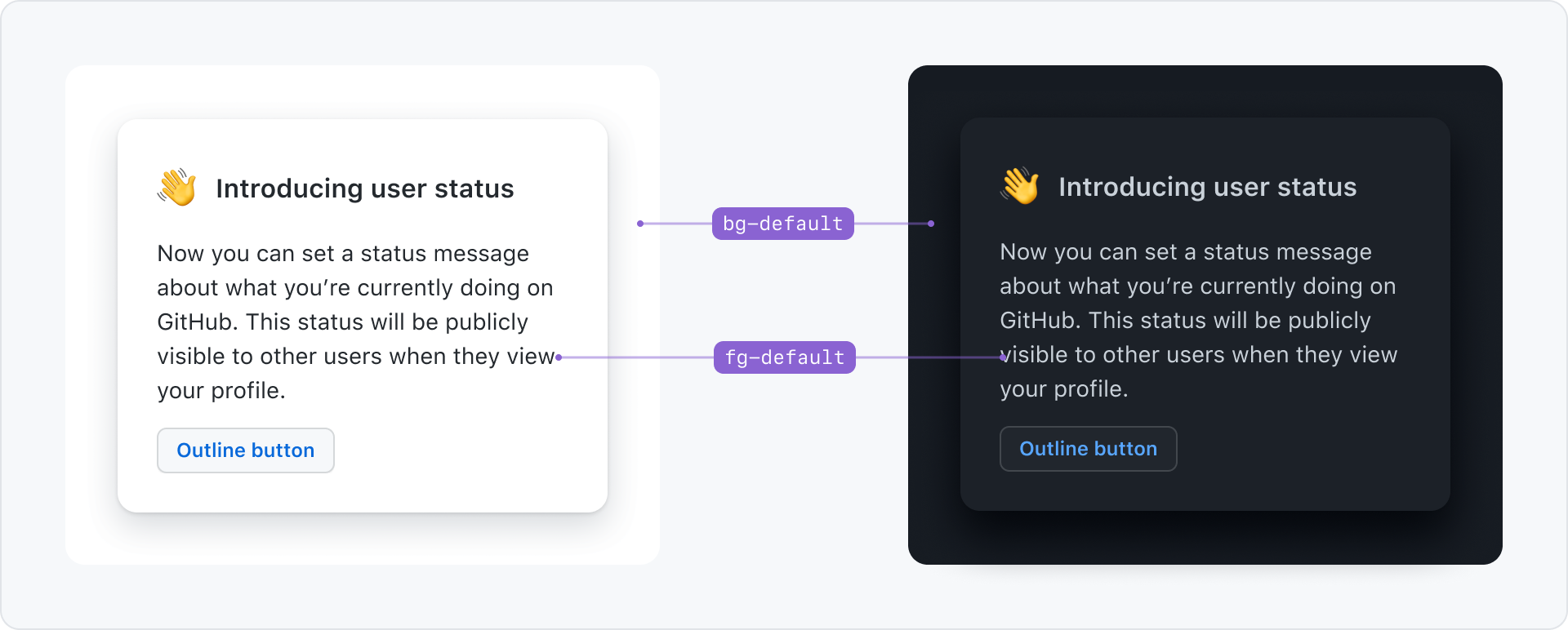
Primer delivers colors in the form of design tokens. Design tokens are a layer of abstraction that allows better maintainability, consistency and easy theming.
For example use bg-default for the background of the page and fg-default for the text color. If the user changes to dark mode, the underlying color that those tokens reference change, but the token names stay the same.
Color design tokens are grouped based on their purpose:
- Presentational: To represent a color. For example, the color steps in the Primer scale are named by color and lightness, such as
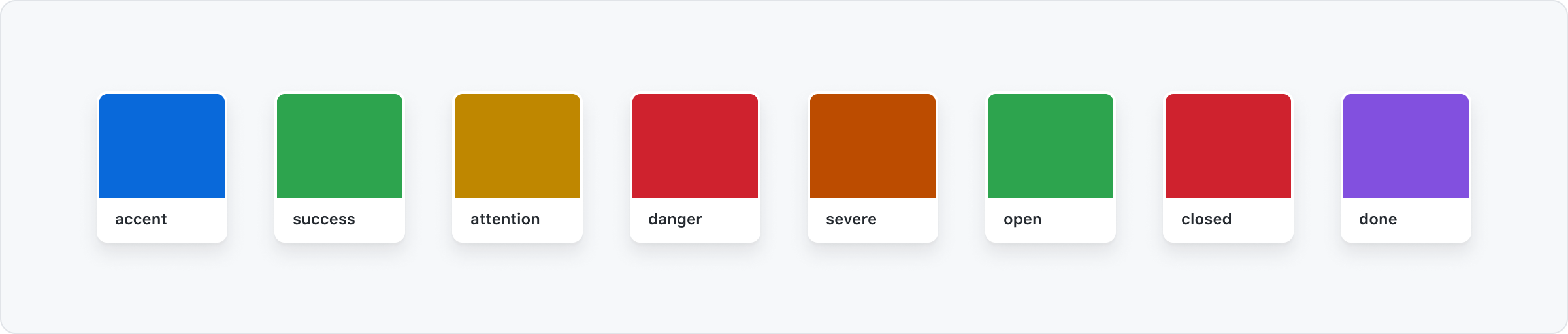
scale.blue.5. These design tokens don't support color modes. - Functional: To convey a meaning or a state. For example, from a functional perspective the color green is used to reinforce positive messaging. In a functional system, green design tokens are named with the suffix
.success. - Component: To represent a specific use case. For example,
button.bgreferences from the system to be used as the background of a button component.
As the system grows, it will provide more APIs that fit different color needs. Check the Primer Primitives repository to follow along as we release new design tokens and systems.
Functional system
The functional system is based on the meaning, or purpose, that colors have in the interface. Use functional design tokens in designs and code to build product interfaces.
By using Primer's functional color system you make sure that your interface:
- supports color modes out of the box
- gets all future themes updates "for free"
- uses accessible color combination across themes
The functional system is structured into two groups of design tokens:
- Foundations: Foregrounds (text and icons), backgrounds, and borders that make up most of a product interface.

- Color roles: Foregrounds (text and icons), backgrounds, and borders that highlight affordance or the meaning of elements in the UI.
Foregrounds
Foreground elements are text and icons. You can apply color to them by using any of the fg (short for foreground) design tokens.
| Foundations | Usage |
|---|---|
fg.default | Primary color for text and icons in any given interface. It should be used for body content, titles and labels. |
fg.muted | Use for content that is secondary or that provides additional context but is not critical to understanding the flow of an interface. |
fg.subtle | Use for placeholder text, icons or decorative foregrounds. |
fg.onEmphasis | On emphasis is the text color designed to combine with .emphasis backgrounds for optimal contrast. |
| Color roles | Usage |
|---|---|
fg.accent | Use for interactive text or icons like links or buttons. |
fg.success | Use to emphasize a positive message. |
fg.attention | Use to highlight text or icons that require the user's attention. |
fg.danger | Use to emphasize an error or a blocking status. Action is required. |
fg.severe | Use to emphasize a level of severity between attention and danger. |
fg.open | Use to style text that refers to open tasks or workflows. |
fg.closed | Use to style text that refers to closed tasks or workflows. |
fg.done | Use to style text that refers to completed tasks or workflows. |
Backgrounds
Background colors apply to surfaces of components or UI elements, such as pages, boxes, and overlays.
| Foundations | Usage |
|---|---|
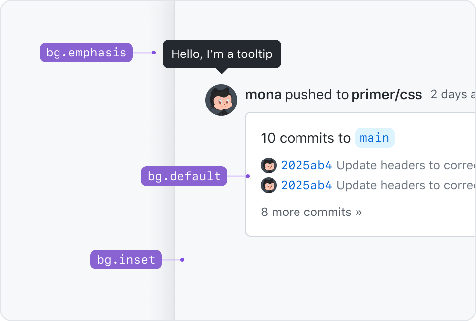
bg.emphasis | Provides the highest contrast against the default background, such as in tooltips. |
bg.default | Primary background color. |
bg.subtle | Provides visual rest and contrast against the default background. |
bg.inset | Can be used instead of the default background to create a focal point, such as in conversations or activity feeds. |
| Color roles | Usage |
|---|---|
bg.accent | Use to accentuate interactive areas in the UI like selected elements. |
bg.success | Use to highlight a positive message. |
bg.attention | Use to highlight elements that require a user's attention or pending statuses. |
bg.danger | Use to emphasize an error or a blocking status, where action is required. |
bg.severe | Use to emphasize an extra level of severity between attention and danger. |
bg.open | Use to style text that refers to open tasks or workflows. |
bg.closed | Use to style text that refers to closed tasks or workflows. |
bg.done | Use to style text that refers to completed tasks or workflows. |
bg.[ANY_OF_ABOVE].emphasis | Use to highlight the most important item of a view or an interface. |
Borders
Borders can be used to group content or to create a visible separation between sections or items. They’re most commonly used on tables, side sections, and cards.
| Foundations | Usage |
|---|---|
border.default | Use to create bounds around content, for example elements inside a card. Default borders are critical to understanding a page layout. |
border.muted | Use for dividers to emphasize the separation between items, columns or sections. |
| Color roles | Usage |
|---|---|
border.accent | Use to accentuate interactive areas in the UI like selected elements. |
border.success | Use to highlight a positive message. |
border.attention | Use to highlight elements that require a users attention or pending statuses. |
border.danger | Use to emphasize an error or a blocking status. Action is required. |
border.severe | Use to emphasize an extra level of severity between attention and danger. |
border.open | Use to style text that refers to open tasks or workflows. |
border.closed | Use to style text that refers to closed tasks or workflows. |
border.done | Use to style text that refers to completed tasks or workflows. |
border.[ROLE].emphasis | Use to highlight the most important item of a view or an interface. |
Functional system in action
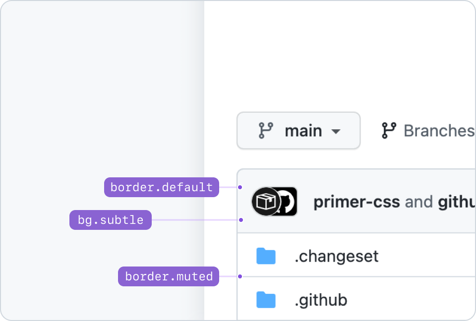
Example of pairing foundation tokens: bg.subtle with border.default, and border.muted.
Thinking in terms of elevation, bg.inset would represent an underground level. It's meant to create a feeling of focus or depth.
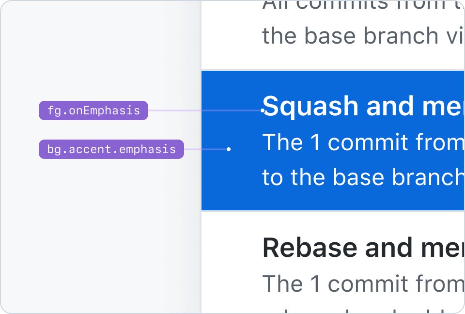
fg.onEmphasis pairs with bg.[ANY_COLOR_ROLE].emphasis tokens. This example shows fg.onEmphasis paired with bg.accent.emphasis.
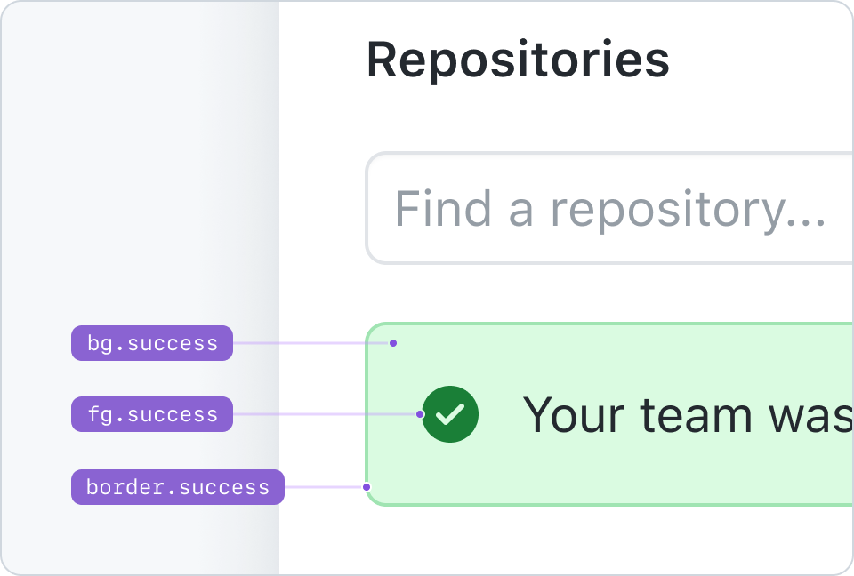
An example of an alert that pairs bg.success, fg.success, and border.success.
Combining colors
Not all colors pair well with each other. There are combinations of backgrounds and foregrounds that guarantee compliance with WCAG contrast guidelines and a wide range of hierarchical relationships between elements. Never use color on its own to convey a message or meaning. Pair it with explicit text and icons instead.
Pairing color roles
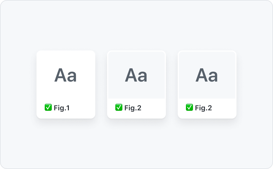
Pair color role foregrounds with their background counterparts or with bg.default and bg.subtle.
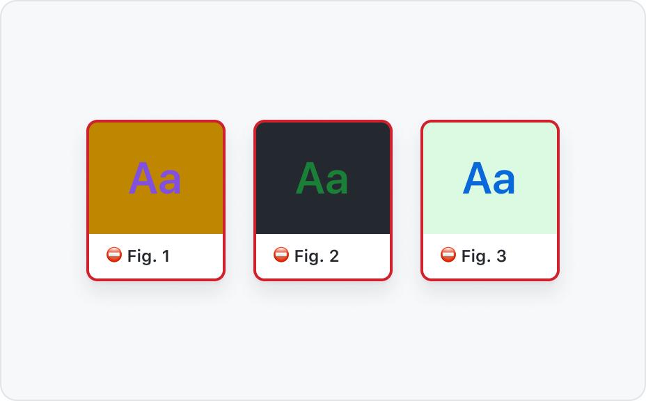
Never pair emphasis foregrounds with emphasis background.
Color roles and foregrounds
Only use fg.muted with bg.default, bg.subtle, and bg.inset.
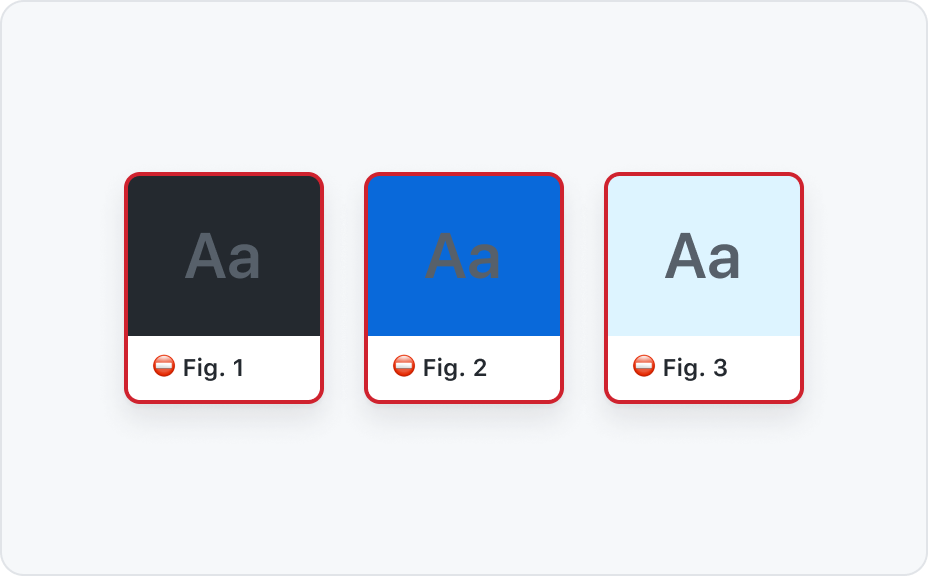
Never use fg.muted on bg.emphasis or any of the color roles backgrounds.
Color roles recipes
![Combination of design tokens 1: bg.[COLOR-ROLE] + border.[COLOR-ROLE] + fg.[COLOR-ROLE]](https://user-images.githubusercontent.com/378023/156498633-d6e47cb1-64b4-46fb-90d6-65a5c4c6a2bc.png)
![Combination of design tokens 2: bg.[COLOR-ROLE] + border.[COLOR-ROLE].emphasis + fg.[COLOR-ROLE]](https://user-images.githubusercontent.com/378023/156498642-f86a24b7-53ea-4b1e-ab47-0529587b08ef.png)
![Combination of design tokens 3: bg.default + border.[COLOR-ROLE].emphasis + fg.[COLOR-ROLE]](https://user-images.githubusercontent.com/378023/156498649-e81a19bf-c94e-436e-9efc-258a1fd3be57.png)
![Combination of design tokens 4: bg.[COLOR-ROLE] + border.[COLOR-ROLE] + fg.default](https://user-images.githubusercontent.com/378023/156498652-b1121c86-a670-4a92-9a8d-9db3c7e0ed9a.png)
Accessibility
When designing with colors consider the following to make your UI visually accessible.
Assure adequate color contrast
Color contrast between text and its background must meet required WCAG standards.
The contrast requirements are:
- 4.5:1 for normal text
- 3:1 for large text (>24px)
- 3:1 for UI elements and graphics
- No contrast requirement for decorative and disabled elements
Use an online contrast checker or a Figma plugin to test your contrast.
If you work with the functional colors, this work has already been done for you. We checked all recommended combinations, so you are all set.
Don't rely on color alone
Show state with more than color
Color vision deficiency is different for different people. To make sure everyone can understand and use your UI you should show state with more than a change in color. For example by using icons or changing the content.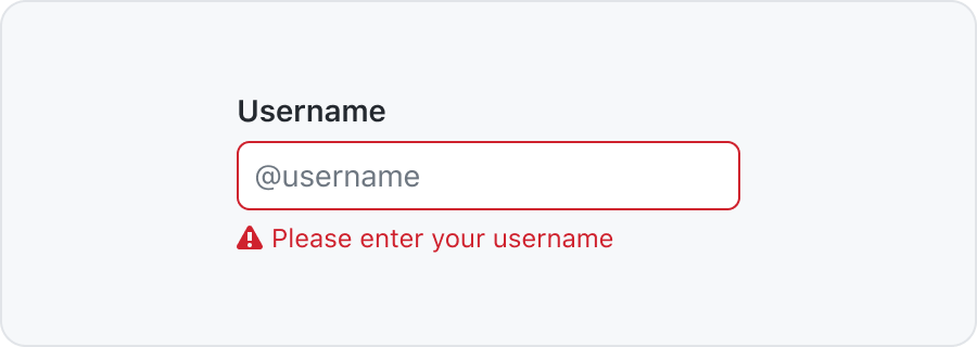
Connect labels to graphs with lines or patterns
For charts and graphs you can position the labels on top or close to each section. You can also use patterns to distinguish different parts.
Color outside the functional system
Primer does not currently provide a presentational or data visualization color system. If you or your team at GitHub are working on a feature that has color needs beyond the functional system, please open an issue in the github/primer repository (only available to GitHub staff).
How to use colors in Primer libraries?
Primer colors exist in different formats and are made available throughout the Primer libraries and tools. Not all colors exist everywhere and the naming depends on the Primer library. Below a list to help find the right Primer color documentation that is specific to that role and environment.
| I am | Documentation | Example color usage |
|---|---|---|
| A product designer working in Figma | Primer Primitives | bg/accent |
| An engineer using Primer ViewComponents | color system arguments | bg: :accent |
| An engineer using Primer React | sx props | accent.subtle |
| An engineer creating custom UI | Primer CSS color utilities | color-bg-accent |
| A Primer React maintainer creating a component | Primer Primitives js properties | accent.subtle |
| A Primer CSS maintainer creating a component | Primer Primitives css variables | --color-accent-subtle |
Stuck choosing the right color? Feel free to reach out in the #primer Slack channel.