Dialog
Dialog is a floating surface used to display transient content such as confirmation actions, selection options, and more.
On this page
On this page
Overview
Dialogs can streamline the interface by allowing extra content to be disclosed as needed. Dialogs create a new modality to the user, and can expedite the completion of individual tasks.
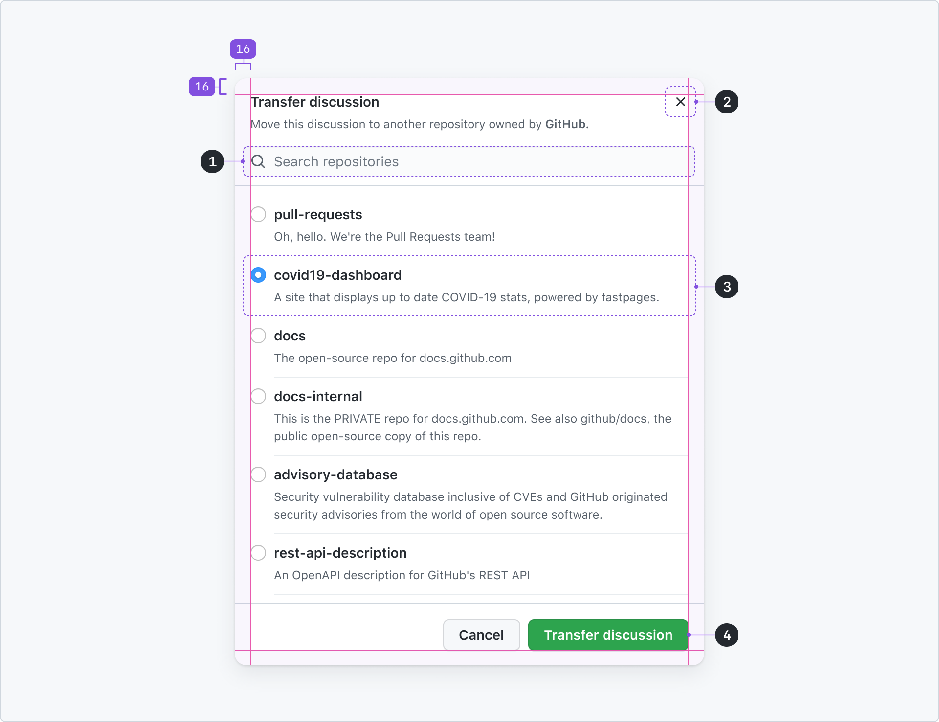
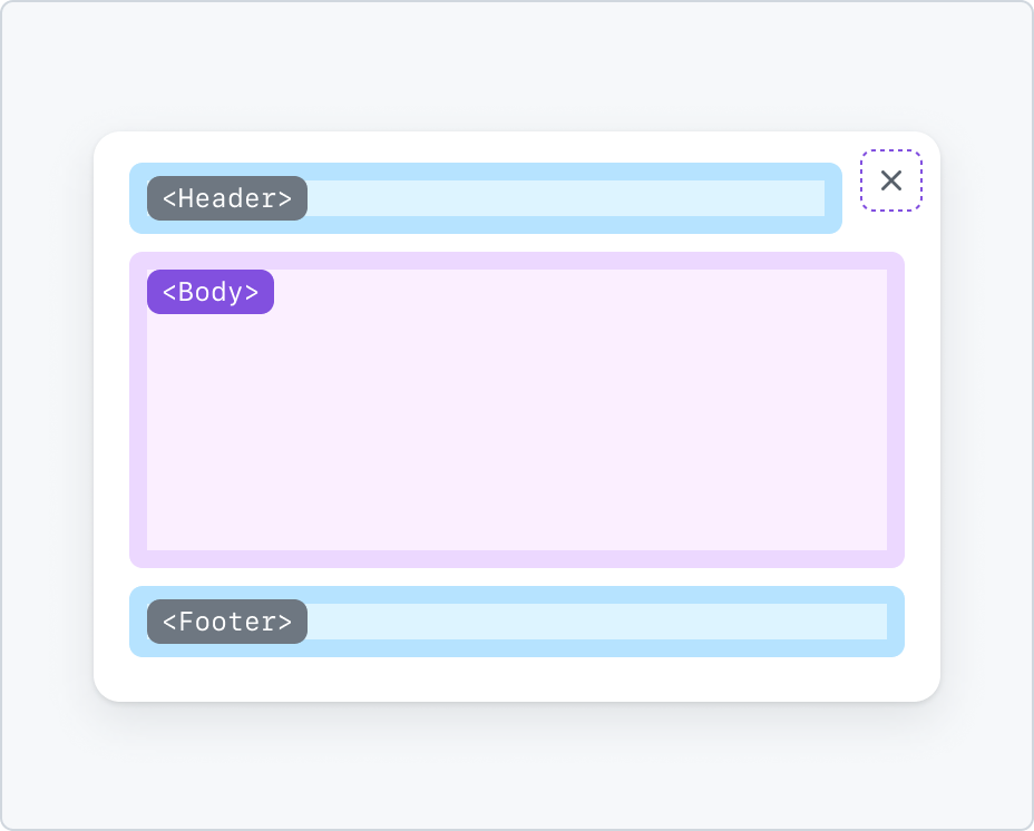
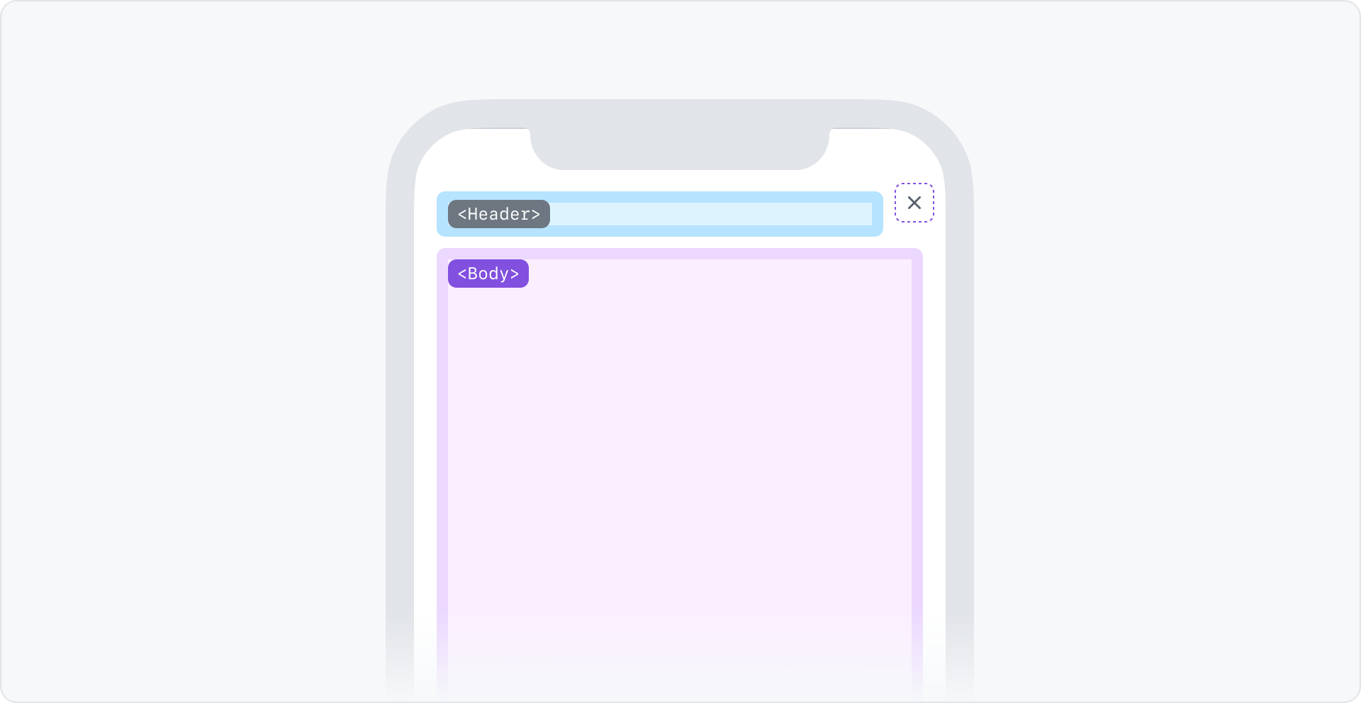
Anatomy
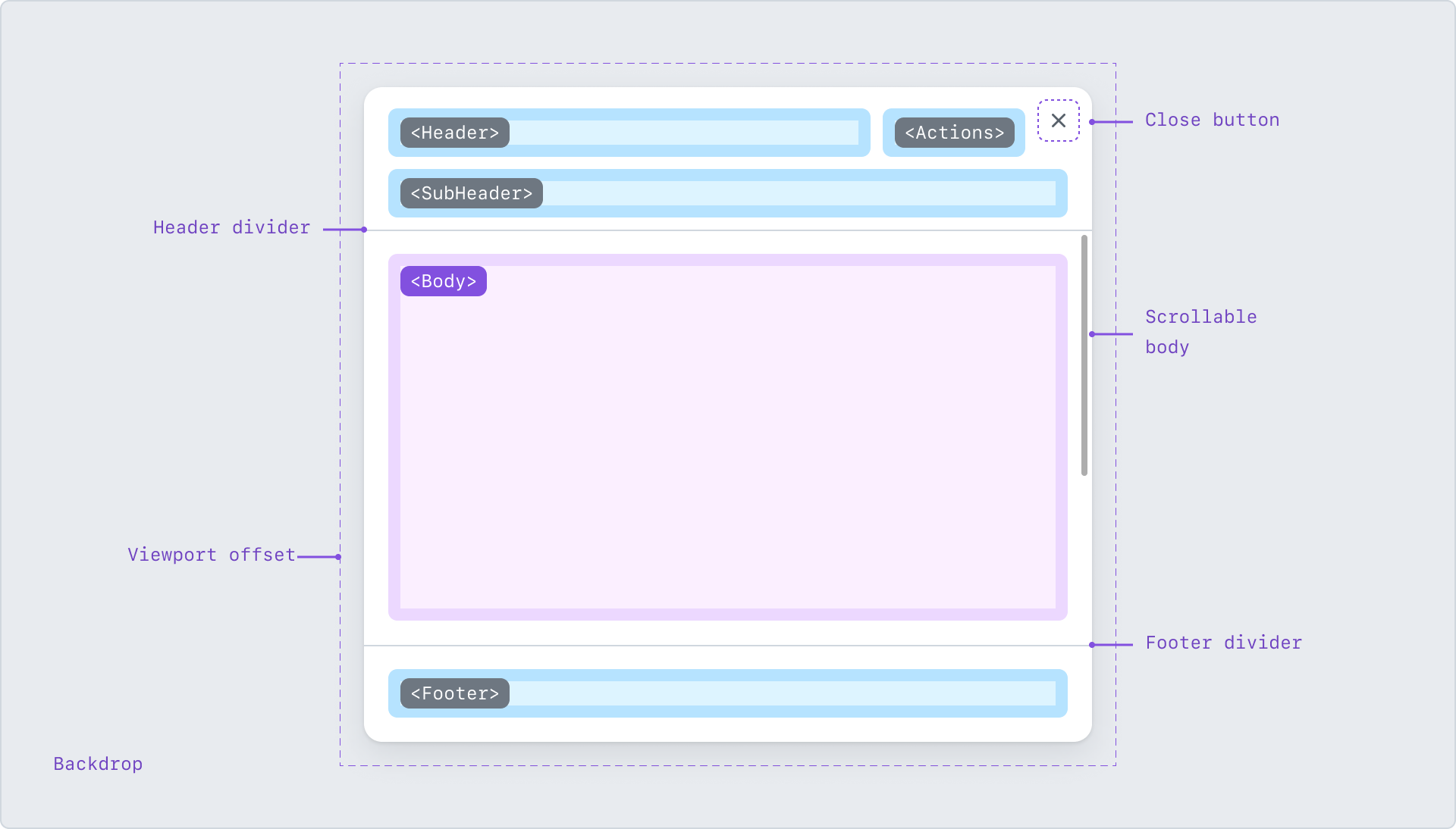
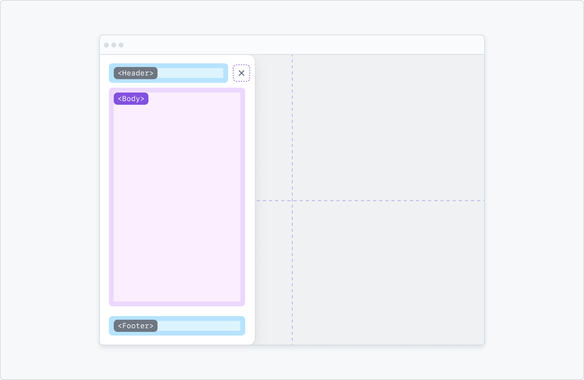
Anatomy of a Dialog.
Header region
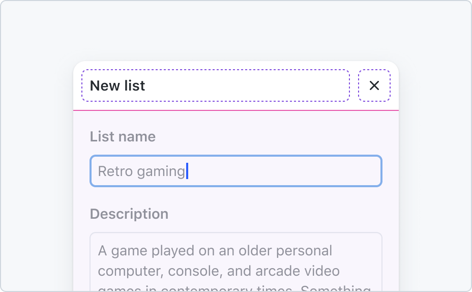
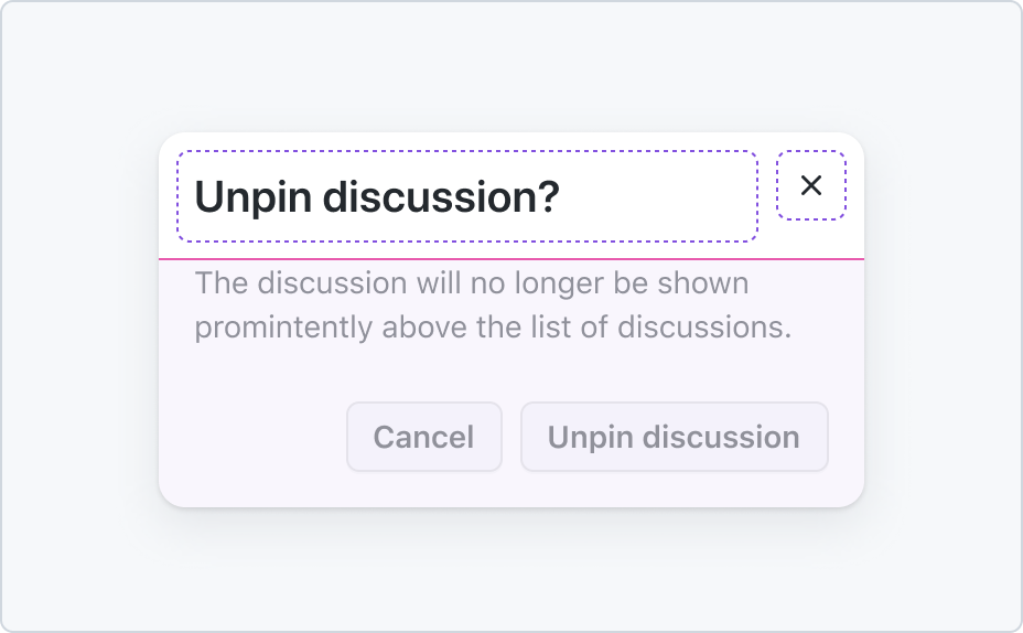
The header region provides context for the Dialog. By default, the region supports a title, description, and a close button. Titles and descriptions may wrap to multiple lines if necessary.
The title is required for all Dialogs, but may be visually hidden for custom scenarios such as a command palette. The close button is required and may not be visually hidden. The title has a default size along with a larger option for confirmation dialogs.
The header region provides a slot for custom content in place of the default title/description, though a title is still required and may be visually hidden. Secondary action icon buttons may be placed next to the close button.
Header with the default title variant.
Header with large title variant.
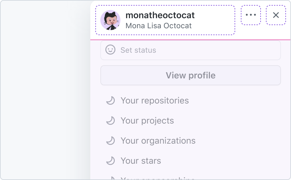
Header with custom variant and a secondary action button.
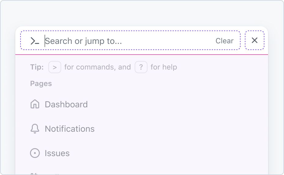
Command palette with a visually hidden title.
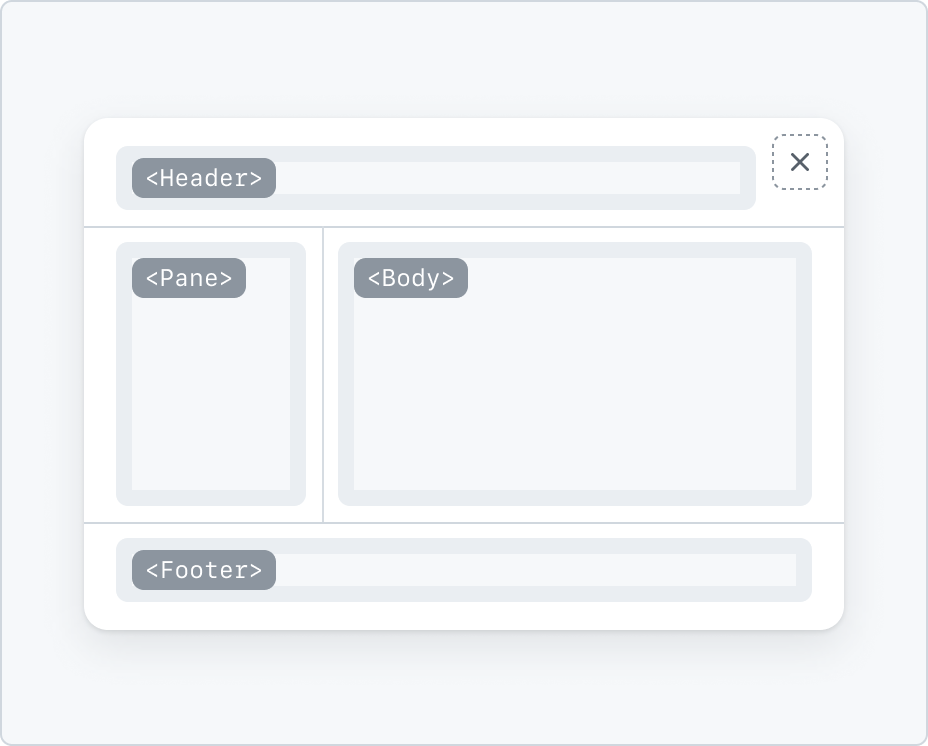
Subheader region
The subheader region is an optional space for interactive controls. Use it to display a search field, a filter menu, or a local navigation component.
Header displaying a subheader with a search field.
Header displaying a subheader with a local navigation.
Body region
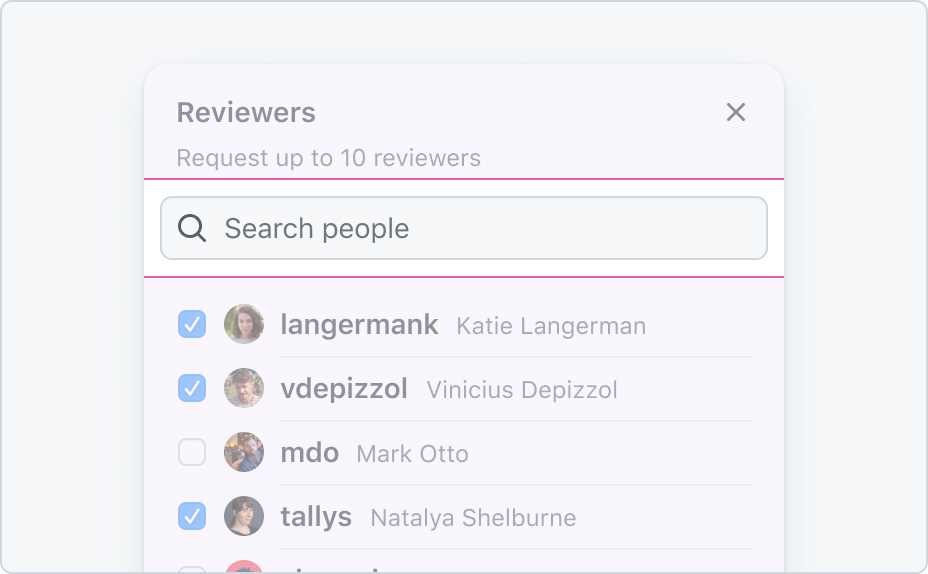
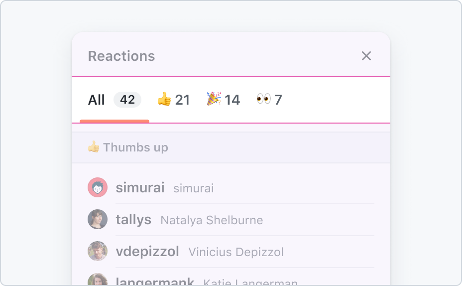
The body region is the main content of the dialog. It can contain any content that is relevant to the task at hand. The body region is scrollable if the content exceeds the height of the dialog.
Body content will scroll vertically if the content exceeds the overall dialog height.
The body may contain additional content such as banners and form controls.
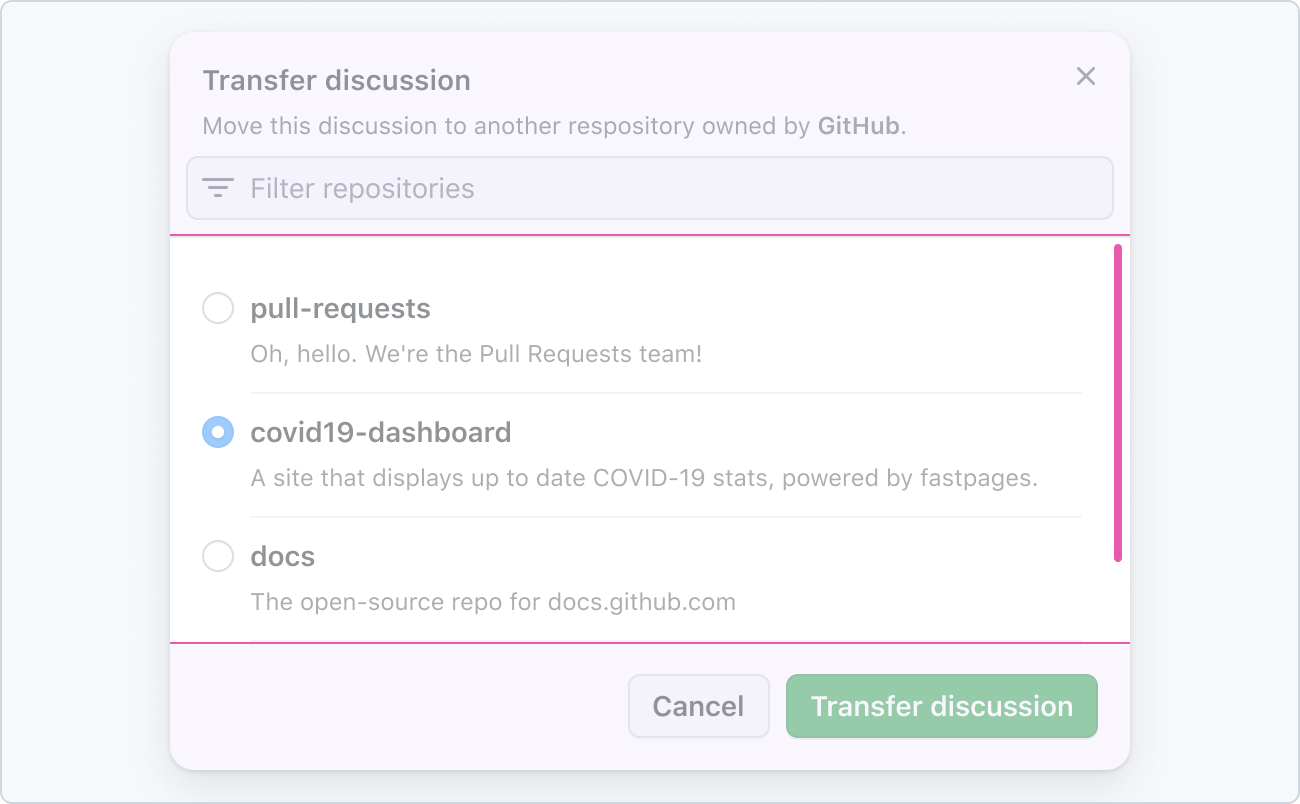
Footer region
The footer region may be used to show confirmation actions, navigation links, or specialized actions. Primary actions should be aligned to the right of the footer, and grouped by additional related actions. Secondary actions may be shown aligned to the left side.
If the content area has overflow scrolling, a divider should be added between the footer and content area. Otherwise, showing a divider is optional.
Use buttons in a footer to let the user complete a task.
Footer with small buttons aligned to the right.
Footer with an auxiliary action aligned to the left.
Backdrop
Dialog displays with a backdrop, which dims the rest of the page. The backdrop is visible when the dialog is centered on the page, or attached to a side as a sheet.
By default, clicking on the backdrop will dismiss the dialog. However, if the dialog contains a form that can have unsaved changes, the backdrop won't dismiss the dialog, regardless of the state of the form.
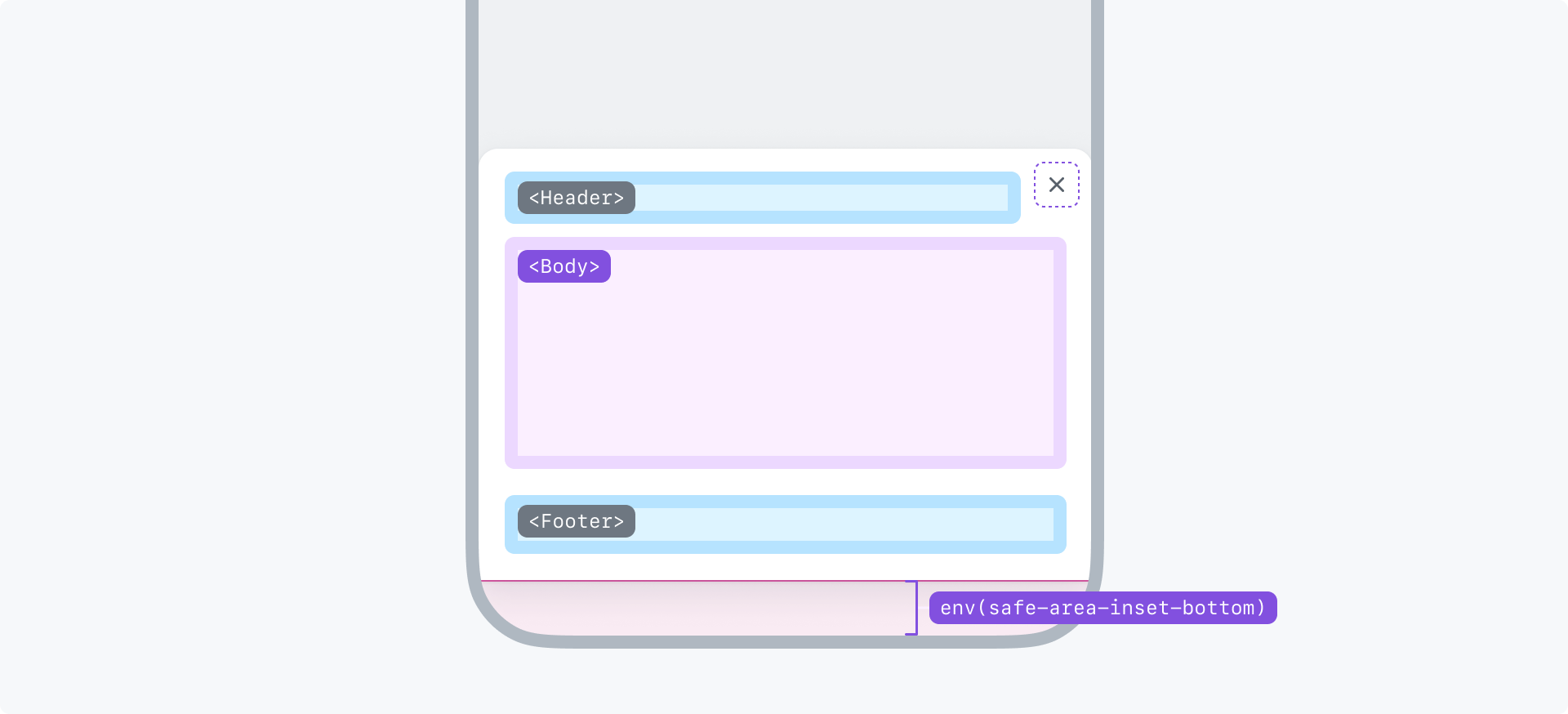
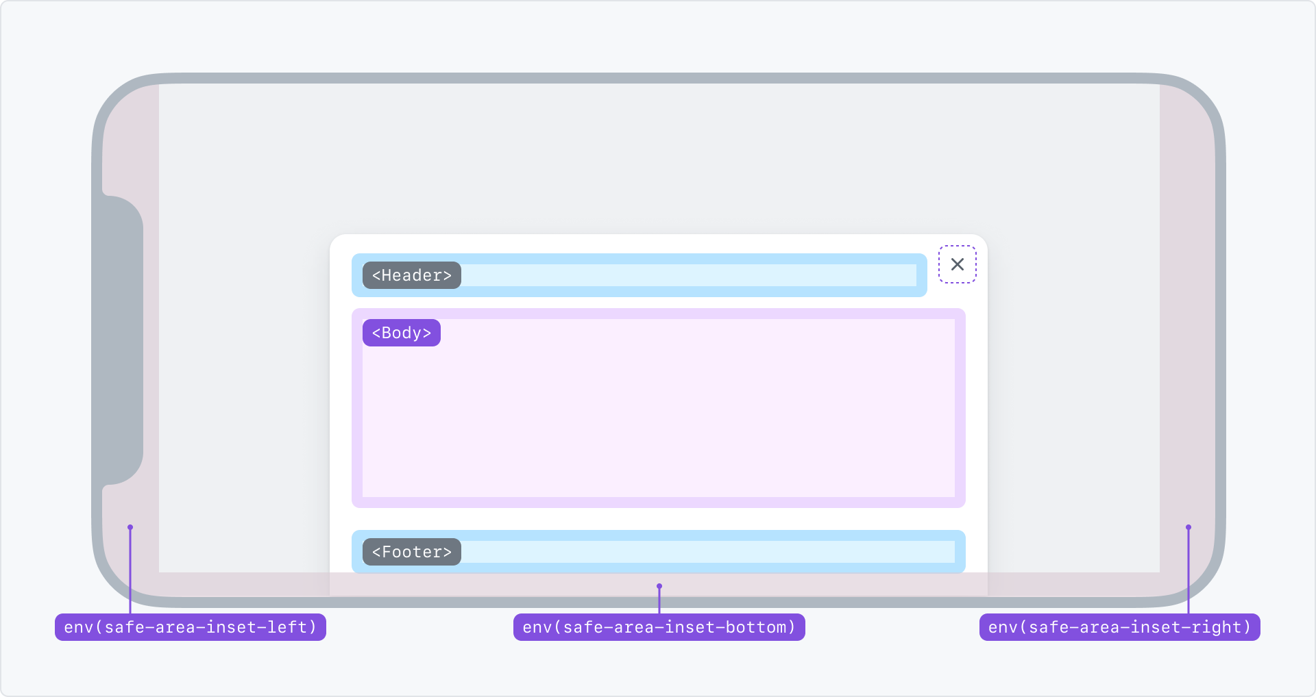
Spacing
The edges of dialog are free of text and heavy visuals to visually distinguish the dialog as an elevated surface, alongside its shadow. Content within the body and header should remain within the 16px safe area. However, inner components that have transparent or discrete backgrounds may bleed into the padding for visual alignment.
1. A search field in the Subheader region appears closer to the edges. While the search icon remains within the safe area.
2. Close button placed `8px` away from the edges. Note that the "×" glyph remains within the safe area.
3. Action list items in the Body region.
4. Footer buttons always appear inside the safe area.
Size
Dialog offers a range of sizes from small to xlarge, with the default size set to medium.
Each size defines a width and a maximum height. By default the dialog height will adjust to the body content. If the maximum height is reached, the body contents will scroll.
A dialog sizing is constrained by the viewport dimensions. Dialogs will not grow beyond the boundaries of the viewport.
Small viewports force dialogs to remain small. All dialogs need to work on viewports of at least 320px of width, and 256px of height.
Small
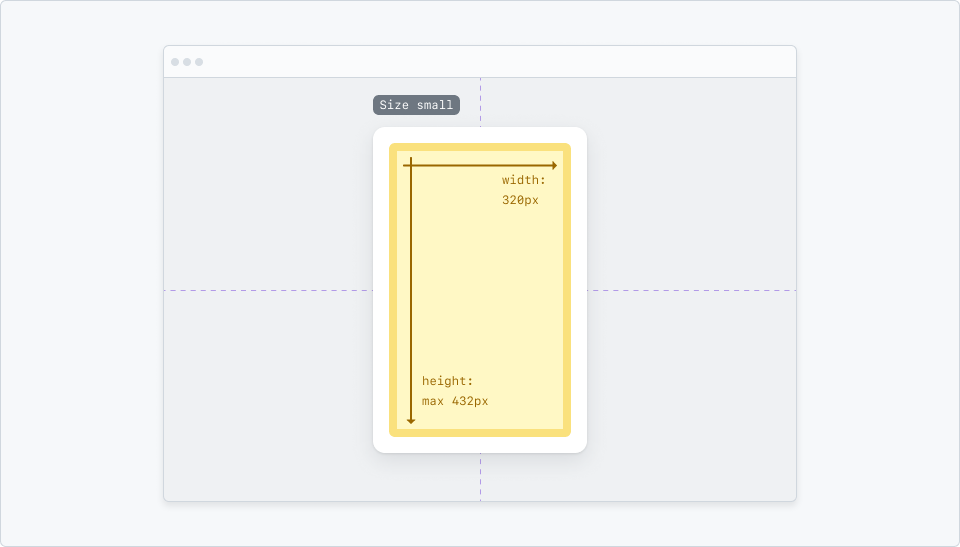
Small dialogs have a width of 320px, and a max height of 256px.
Medium (default)
Medium is the default size for Dialog and should be used for most tasks such as completing a form or selecting an option from a list. The medium portrait size is suitable for longer lists of items that require more vertical space for the body.
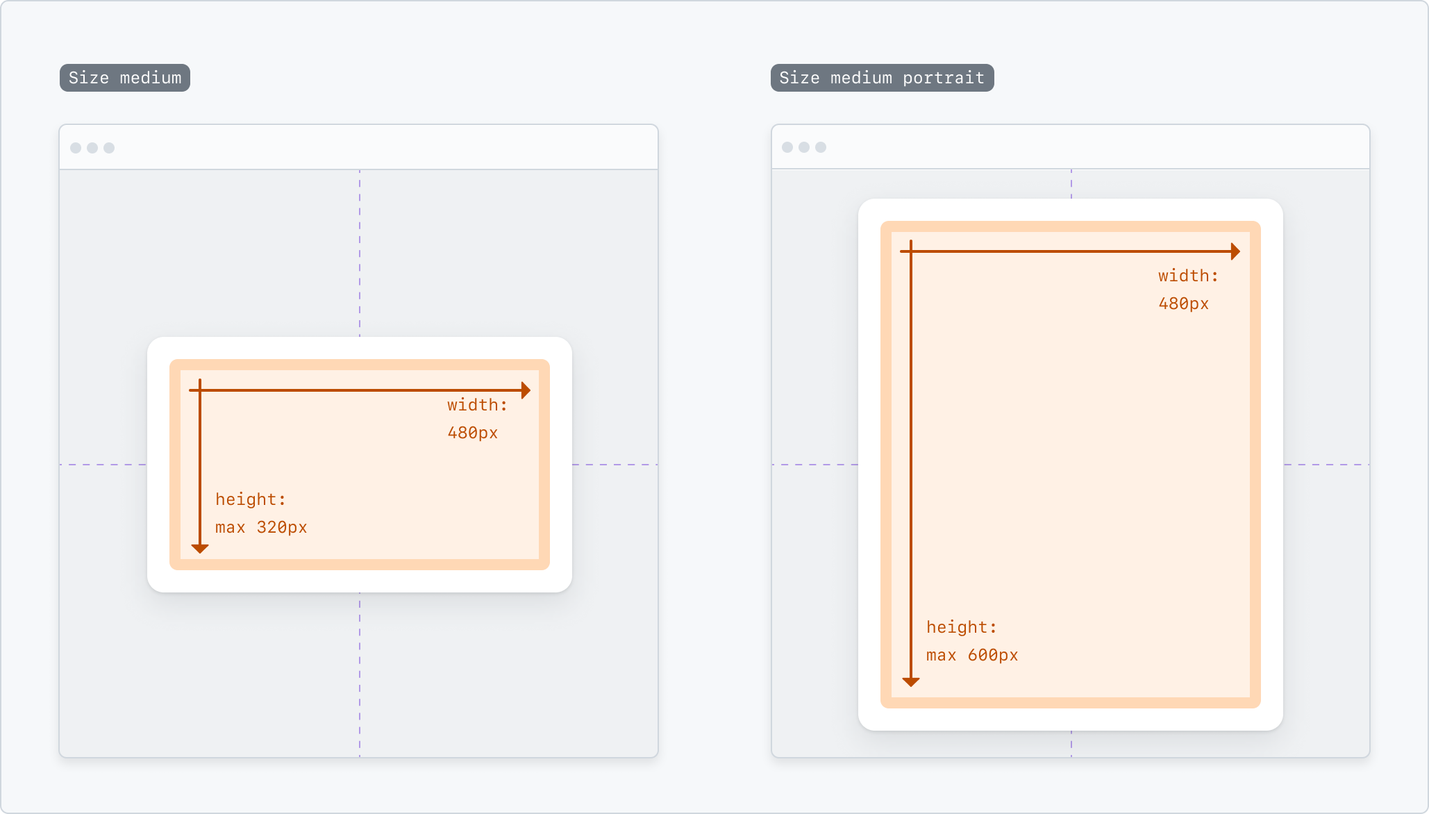
Medium dialogs have a width of 480px, and a max height of 320px. Medium portrait oriented Dialogs have a width of 480px, and a max height of 600px.
Large
Large dialogs are suitable for content that requires more horizontal space for the body compared to size medium, such as a comment box.
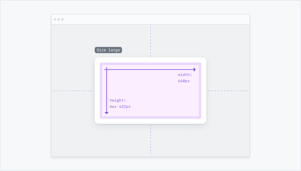
Large dialogs have a width of 640px, and a max height of 432px.
Extra large
Before using an extra large dialog, consider whether or not the content would be more appropriate for a new page.
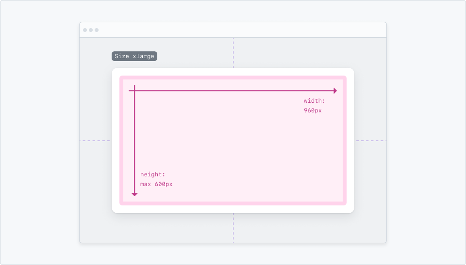
Extra large dialogs have a width of 960px, and a max height of 600px.
Usage
Keep content simple
Dialogs are meant to be interacted with in a single context. Avoid creating a whole page inside a dialog. Prefer single-column layouts that convey a clear goal from the moment the dialog is opened.
However, dialogs are powerful tools when creating space for single-context interfaces. When designing a new feature to support a main interface, start by considering if the new feature can be created under a single context.
If the answer is yes, designing the feature inside a dialog provides an easy way to add responsive support, and avoid deeper navigations. If the answer is no, or if a side navigation is required for the feature, consider designing a new page.
Prefer a single column layout.
Avoid side navigation within a Dialog.
Dialogs should work well on any device
Dialogs must adjust their designs to fit in smaller viewports. Make sure the overlay contents work with all supported sizes and input methods.
Center aligned dialog becomes fullscreen on narrow viewport.
Center aligned dialog becomes a bottom sheet on narrow viewport.
Regular-viewport placement
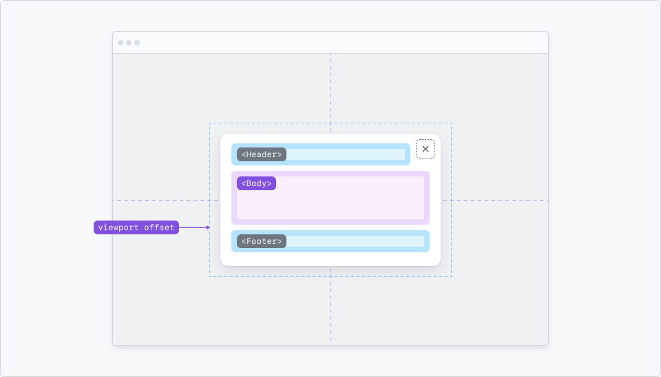
Centered
By default, dialog appears centered in the viewport, with a visible backdrop that dims the rest of the window for focus. Centered dialogs are surrounded by a safe area of 16px between the frame and the viewport for all sizes.
Dialog centered within a desktop screen.
Side sheets
Side sheets slide from the right or left edges of the viewport. Left side sheets are reserved for global navigation drawers. Right side sheets are used for global actions, but can also be considered for quick previews in full-width pages, or configuration panels.
Side sheets take the entire height of the viewport, and should be used sparingly. Don't use side sheets to present create/edit forms, or flows that may contain a lot of information. For that, use a page instead.
Left aligned side sheet is reserved for global navigation only.
Right aligned side sheet can be used for global actions, but may also be considered for quick previews or configuration panels.
Narrow-viewport placement
Bottom sheets
A bottom sheet is a variant supported on narrow viewports made to facilitate reachability. dialogs that appear centered in large screens may adapt to appear as a bottom sheet on small screens.
A bottom sheet always dims the rest of the screen for focus and takes up the full width of the viewport. Tapping on the backdrop dismisses the dialog.
Use a bottom to indicate that the user is still in the context of the main page, and that the dialog is a secondary action.
Bottom sheet in portrait mode.
In landscape mode, a bottom sheet has a maximum width of 480px, and is centered horizontally.
Bottom sheet in landscape mode.
Full-screen
Full-screen dialogs may be used to present content that needs all the available space on narrow viewports, or to act as a new page without navigating away from the main page. Dialogs that have one or more input fields should always use the full-screen variant.
Full-screen Dialog in portrait mode.
Accessibility
Dialog's title and close button are required to ensure an accessible experience for everyone. Further, keyboard and focus behavior must be considered.
Trigger elements and keyboard focus
Dialogs are initially hidden, and can be opened by an element with role="button", called a trigger. The role button allows the trigger to be a relatively complex element, such as an action list item.
Dialogs must be fully functional using the keyboard and assistive technology. Pressing Esc must dismiss a dialog, also returning focus to the trigger that opened it.
Clicking the backdrop or hitting the `Esc` key should dismiss the dialog.
When a dialog is opened, the first interactive element (typically the close button) is focused. For a scenario like a command palette with an <input> next to the close button, the <input> will recieve focus first. Hitting Tab will cycle through all interactive elements within the dialog. To escape the focus trap, hitting the Esc key or clicking on the backdrop will close the dialog. While the dialog is open, page scrolling is disabled and becomes inert.
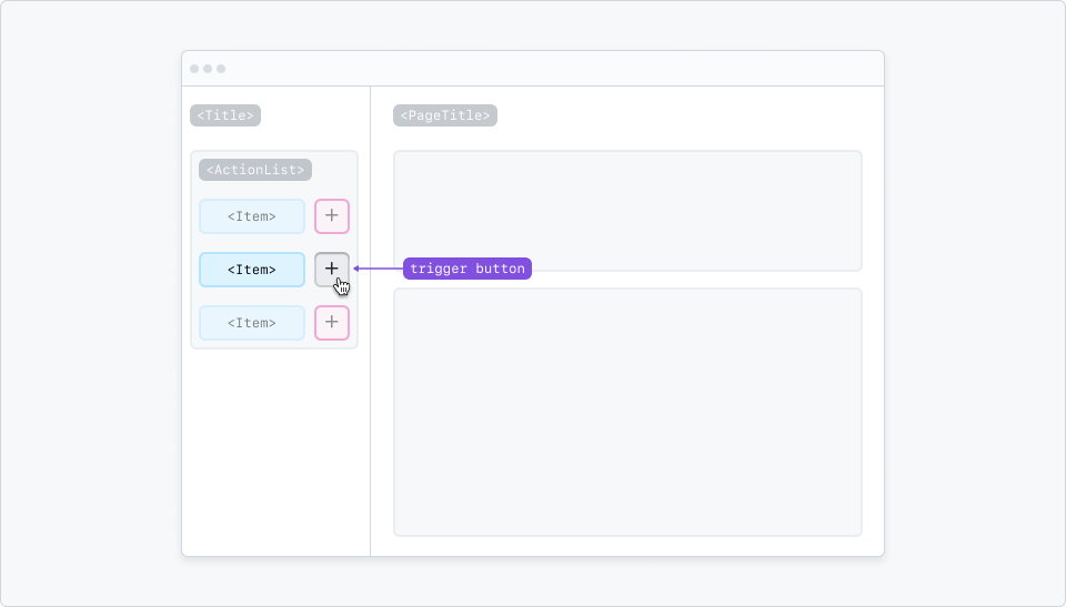
Dialogs can be triggered by buttons with a mouse click or keypress.
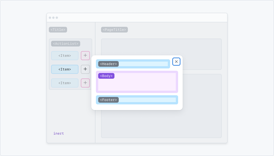
The first interactive item inside a dialog is focused when opened.
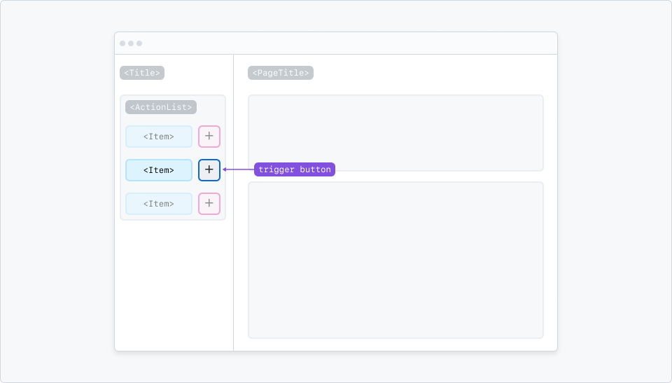
When a dialog is closed, focus is returned to the trigger button.