Tree view
Tree view is a hierarchical list of items that may have a parent-child relationship where children can be toggled into view by expanding or collapsing their parent item.
On this page
On this page
Anatomy

- Parent node: A node that hides and shows child nodes by expanding and collapsing
- End node: A node with no children
- Nesting level indicator lines: Each line represents a level of nesting depth
- Chevron: Toggles a parent node expanded or collapsed and indicates expanded/collapsed state
- Leading visual (optional): A visual cue for additional context
- Node label: The text label for the node
- Trailing visual (optional): Same as a leading visual, but at the end
Content
Node label
Node labels should be a succinct title for whatever entity the node represents. For example, a file name.
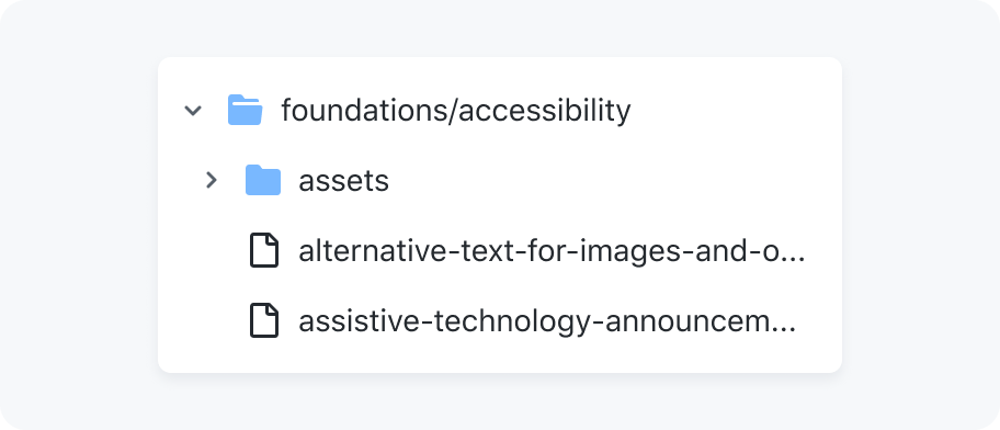
By default, labels are truncated to a single line. However, node labels may be wrapped to multiple lines in cases where the entire label must always be visible.
When a node's text is truncated, it should still be accessible to users via a browser-native tooltip.
Single line truncation

Wrapping node label text
Leading and trailing visuals
Leading and trailing visuals may be used as visual cues that communicate more information about a node.
If the leading or trailing visual contains useful information, make sure it has a screen-reader accessible text label. Note that the file and folder icons are not considered useful information, as the TreeView's underlying markup will communicate their presence.
Either all nodes have leading visuals, or no nodes have leading visuals. Leading visuals must be accompanied by a text label.
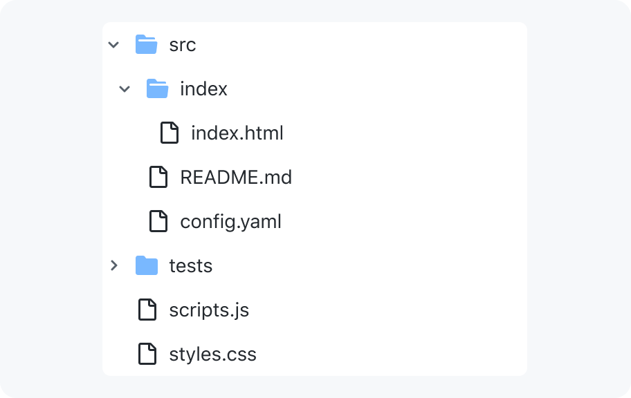
Render all nodes with leading visuals and text labels or just with text labels
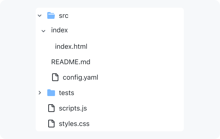
Don't have a tree where only some nodes have leading visuals
Interaction
Keyboard users can expand or collapse nodes without activating them by using the left and right arrow keys.
To give cursor users an equivalent experience, there are two click areas:
- clicking the chevron only expands or collapses the node
- clicking anywhere else will activate the node
If the node cannot be activated, clicking anywhere on the node will expand it.
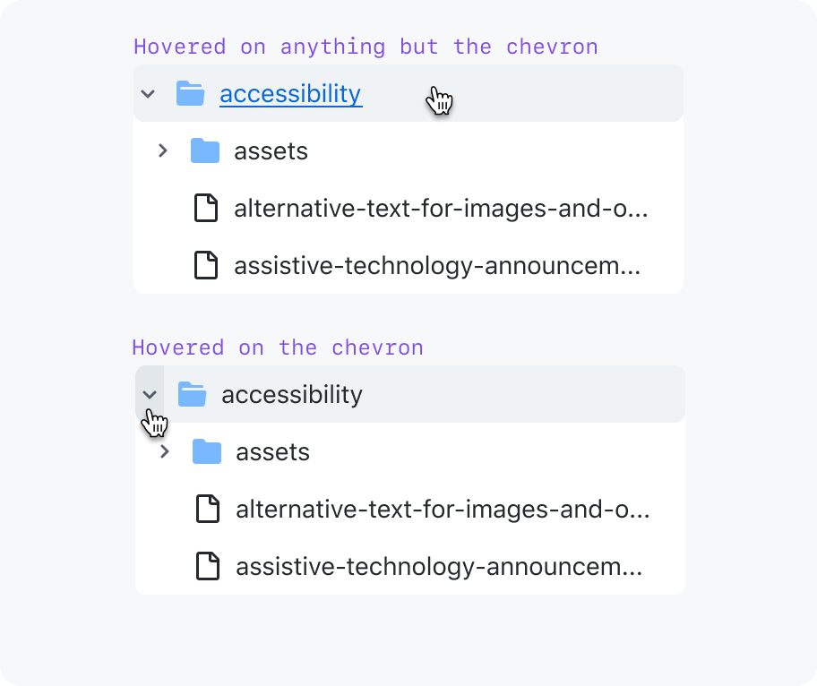
Two click areas - toggle expanded or activate link
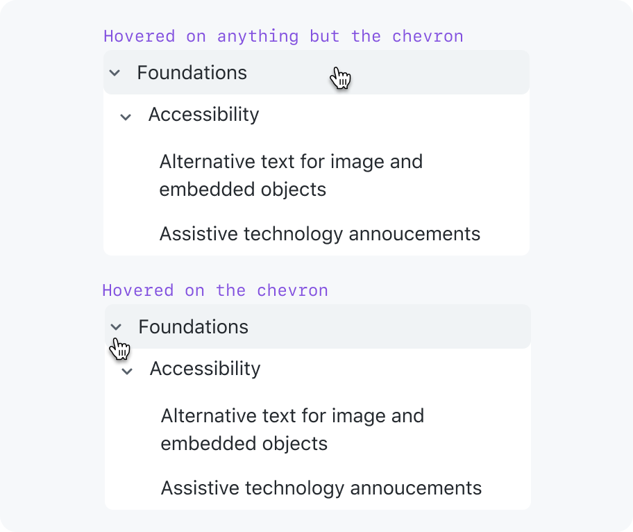
One click area - toggle expanded
Nodes may not contain any other interactive elements besides the chevron. Activating a node can only perform one action. For example, following a link.

Limit nodes to a single action
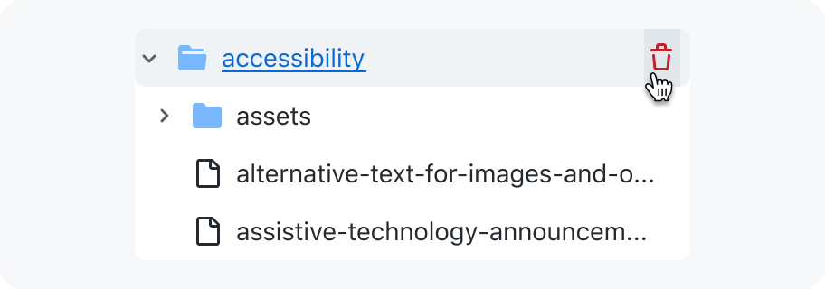
Don't put other interactive elements in a node
We have investigated the feasibility of supporting a context menu for each node, and that could be something we support in the future if we find we need it.
States
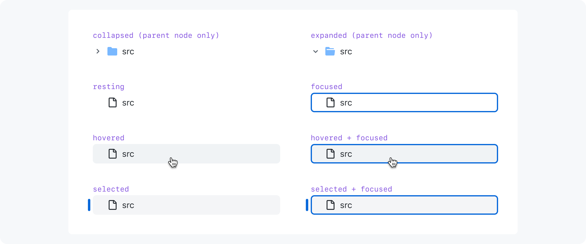
Nodes have different visual treatments to indicate their state and hint what kind of user input they're ready to receive. These styles are inherited from the action list component.
Nesting
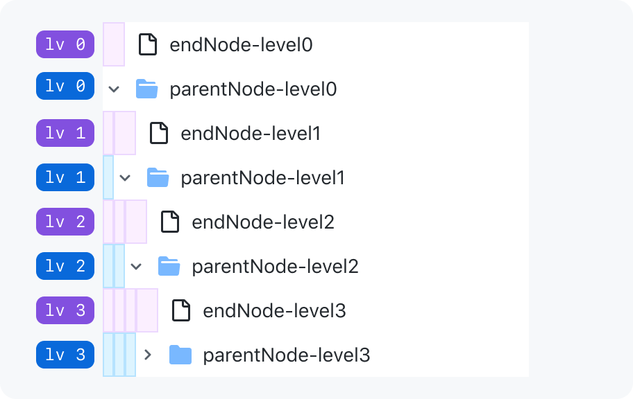
Nodes are visually nested using whitespace and alignment.
Align leading icons
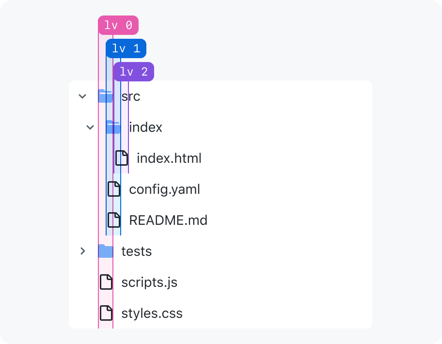
Indentation
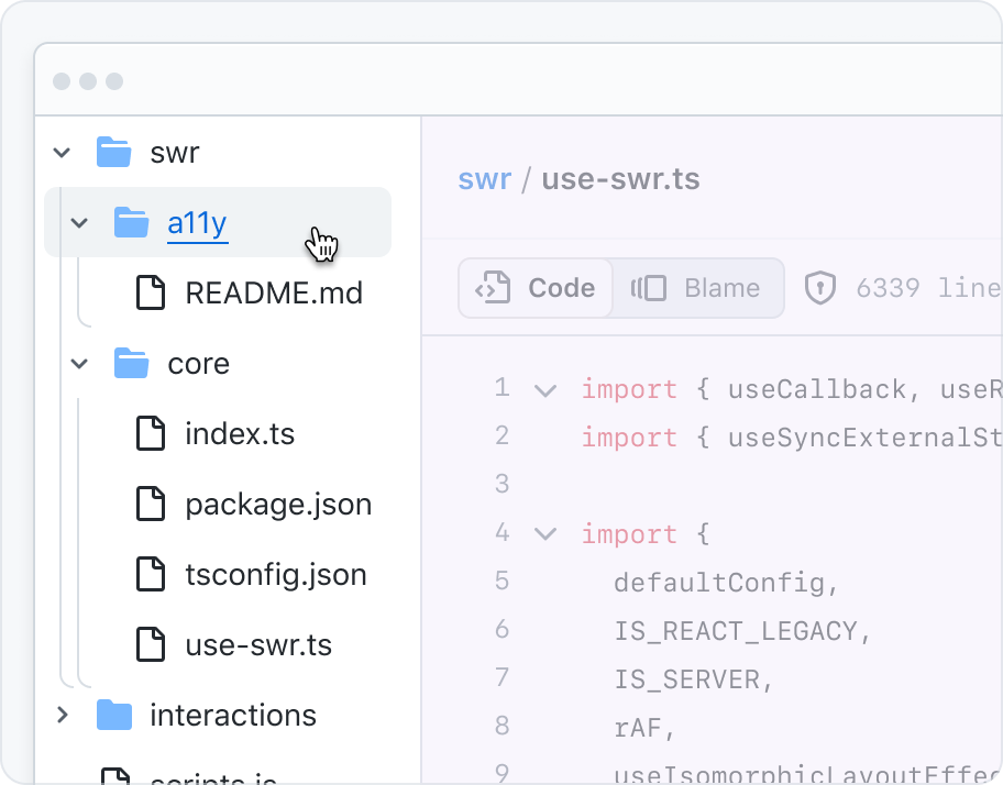
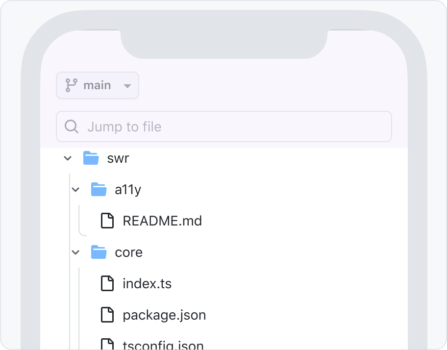
Nesting level indicator lines
On devices with :hover support, the nesting indicator lines fade in when the user mouses over the entire component, or when there's focus inside the component.
On devices without :hover, the nesting indicator lines appear at all times.
Handling deeply nested nodes
Navigating through deeply nested nodes can be cumbersome and visually clunky. If accessing nodes deeper than 10 levels deep is a common interaction for your use-case, reconsider whether a tree view is the best pattern.
Tree views are designed to be horizontally compact in order to support many levels of nesting and long node labels. This makes content truncation and horizontal overflow less likely to occur for deeply nested nodes, but infinite nesting makes those cases impossible to prevent entirely.
There are some strategies to avoid a tree view that horizontally overflows it's container:
- Allow the tree view's container to be manually resized
- Once a certain depth is reached, start the tree view from a deeper parent node and provide a way to navigate back up the tree
- Remove leading and trailing visuals
If a tree view is truly the best pattern for your use-case and none of the suggested strategies prevent horizontal overflow, opt for horizontal scrolling as a last resort instead of hiding overflowing content.
Usage
Tree views are only for hierarchical lists
A tree view solves a very specific problem. It's not a multi-purpose tool like an action list.
- the items in the tree view represent a list
- the list items are likely to have a parent-child relationship with more than 1 level of nesting
- the expand and collapse behavior aids in navigation instead of just making it more complex
- navigating the file structure of a repo
- navigating a codebase's symbols (types, constants, functions, etc) organized by their scope hierarchy
- global sidebar navigation
- an FAQ that collapses answers under question headings
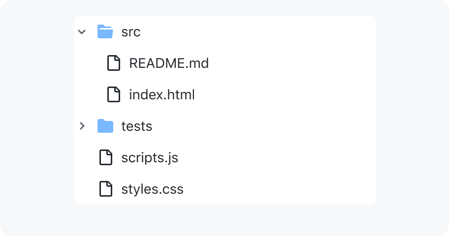
Use a tree view for a list
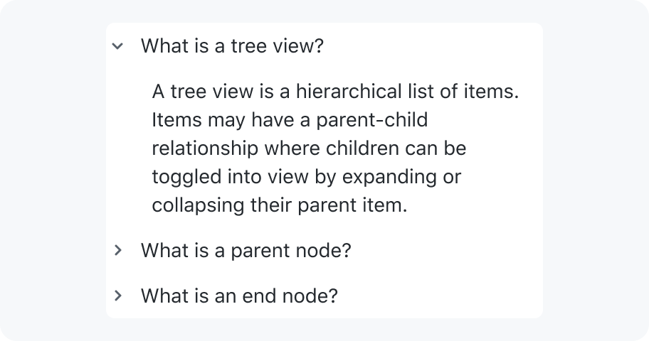
Don't use a tree view for expanding and collapsing sections of content
Expanding and collapsing nodes
A tree view can be a frustrating pattern if it forces users to spend a lot of time expanding and collapsing nodes to find what they're looking for.
Expanded by default
When a child node is active, all of it's parent nodes should be expanded.
If it's likely that a user will want to interact with all or most of the nodes in the tree, render the tree with all parent nodes expanded to start. For example: when reviewing a pull request, all of the changed files are shown to make it easy for reviewers to scan and navigate the changed files.
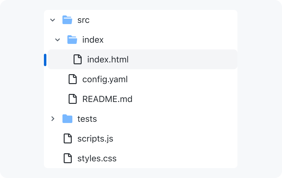
Preserve expanded state when parent node is collapsed
Optionally combine parent nodes

Asynchronously loading child nodes
Show placeholder nodes (preferred)

General loading indicator (fallback)

Handling loading errors
Inform users why the data cannot be retrieved and give them a path to resolve it. The error message cannot appear in the tree view because it is not semantically a node in the tree. Instead, the error message should appear in a dialog with an optional call-to-action that can resolve the error.
If the user dismisses the dialog, focus should be moved back to the collapsed parent node. If the user clicks a call-to-action that attempts to load the child nodes again, focus should be moved to the node in the tree that communicates the child nodes are loading.
If we don't have enough information to write a useful error message, it's ok to write something generic like "Couldn't load".
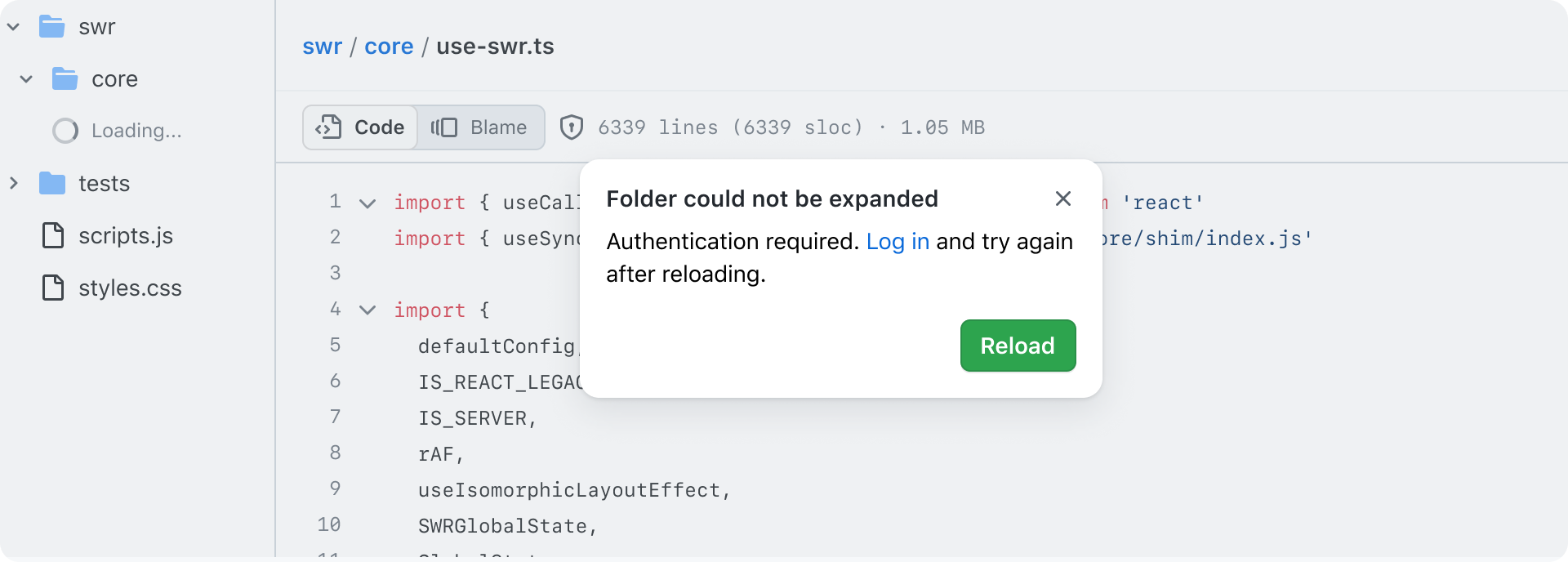
Composition
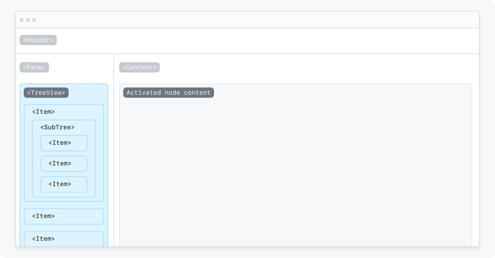
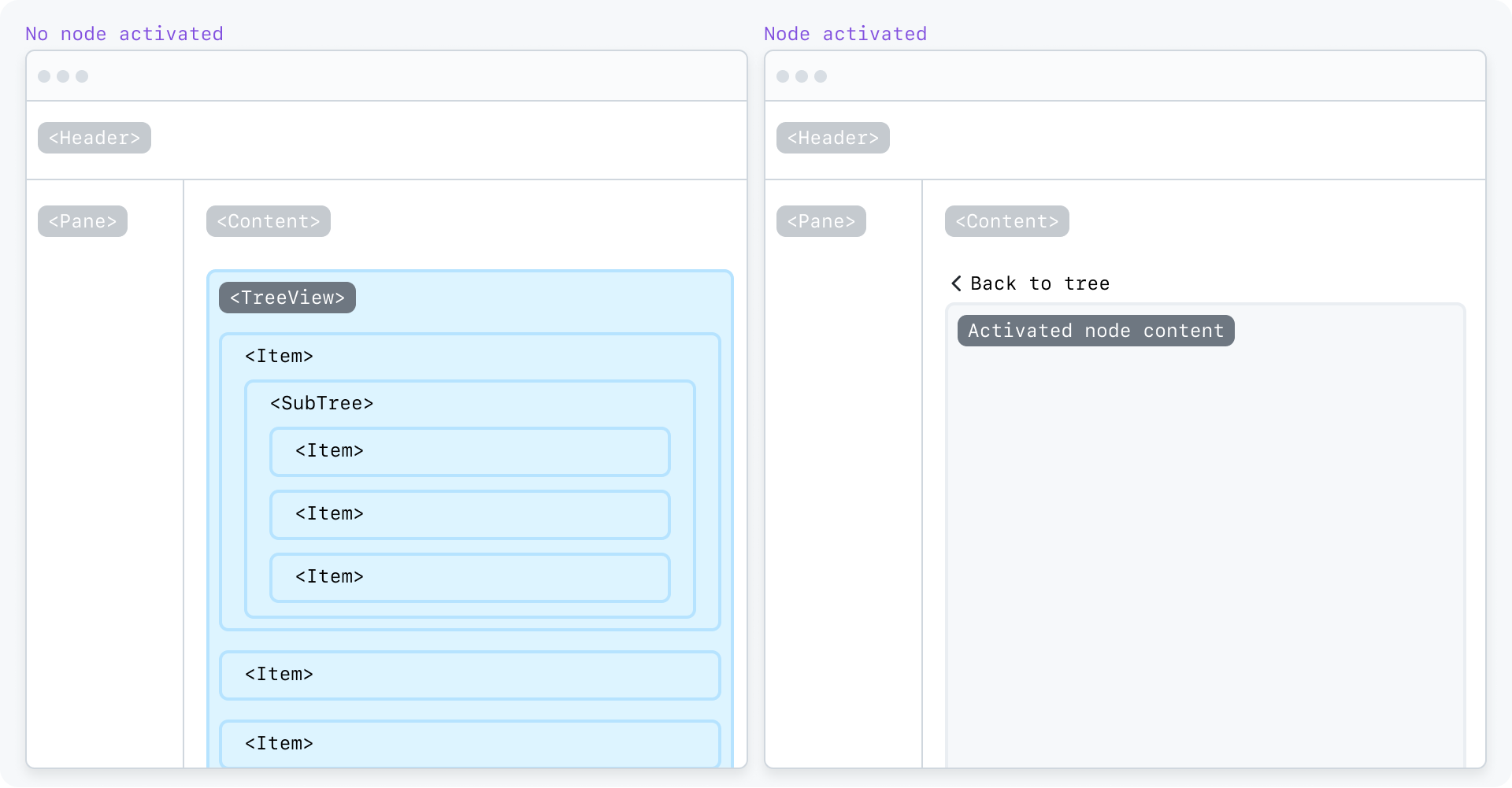
Examples
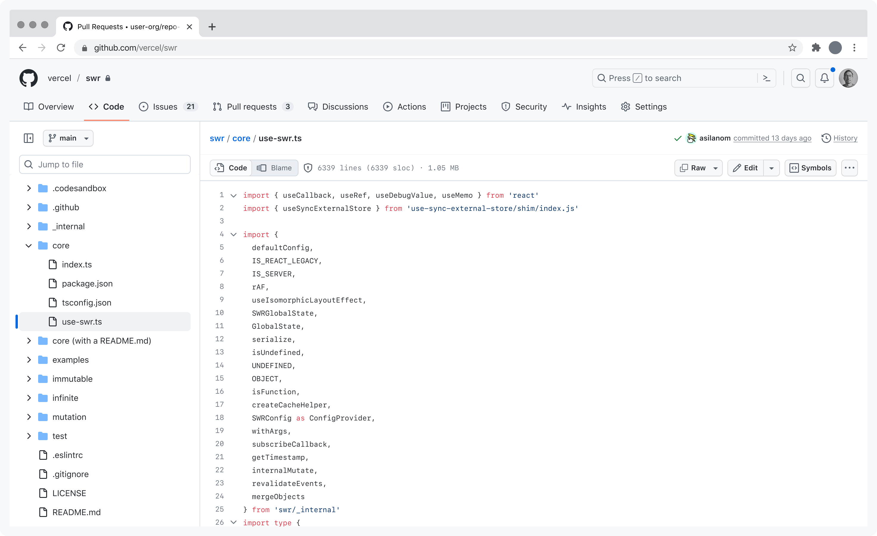
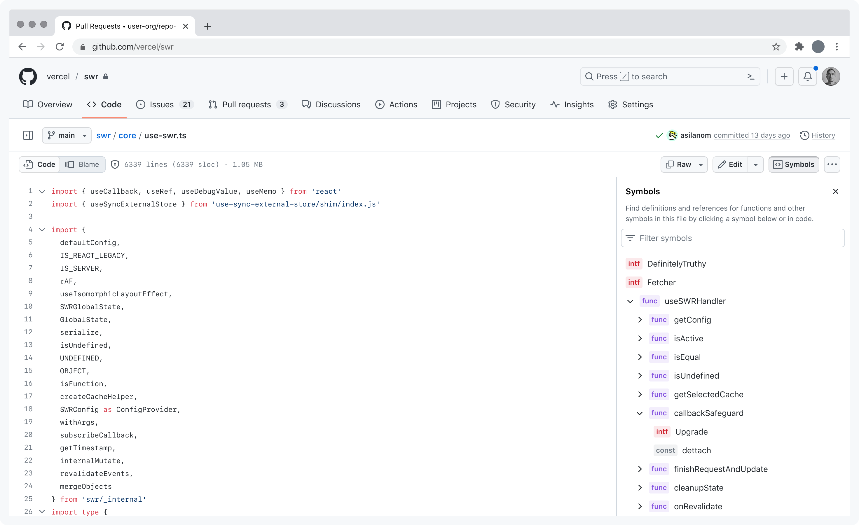
Provide sufficient vertical space
Be considerate of the amount of vertical space a tree view can take up when all of it's nodes are expanded.
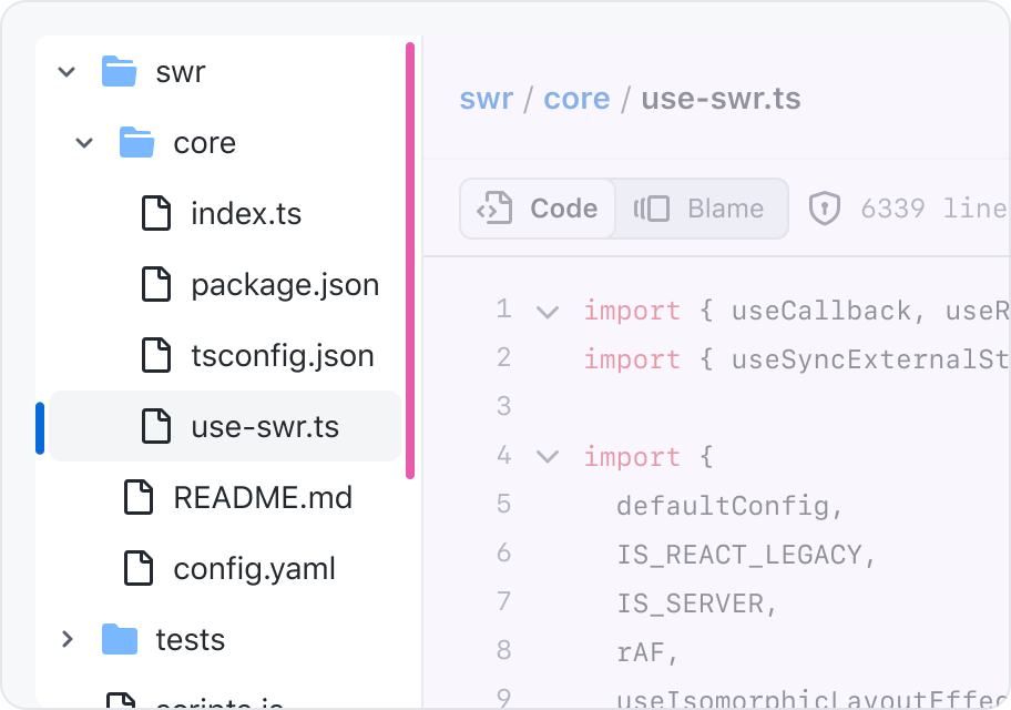
Render a tree view in an area with enough vertical space to comfortably browse the list, and doesn't push important content or controls below the bottom of the viewport
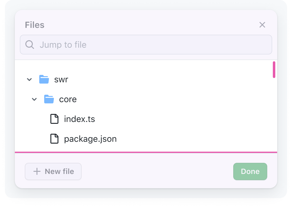
Don't render a tree view in an area that pushes down other content or forces users to scroll through small segments of the list
Accessibility
Label
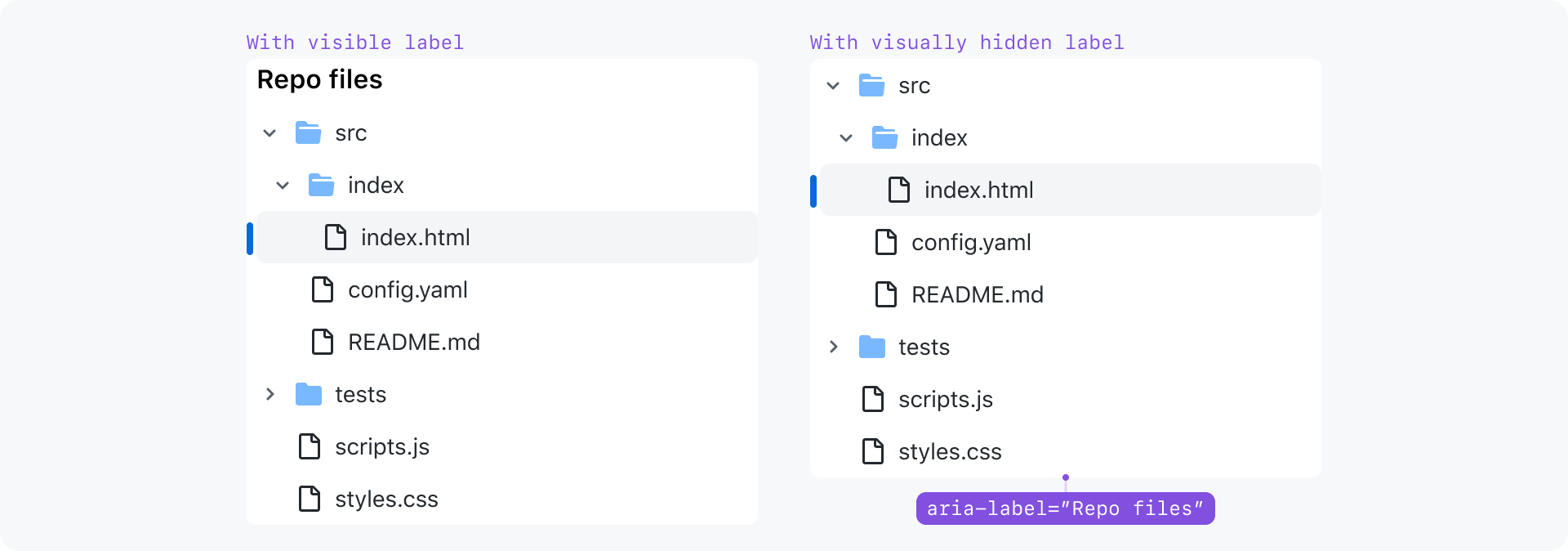
Tree views need an accessible name to be supplied, ideally via `aria-labelledby` pointing at an appropriate heading before the tree. If the tree view has enough surrounding context that it doesn't need a visible label, apply `sr-only` to the heading to hide it visually, but preserve the underlying programatic association.
Keyboard navigation
| Key(s) | Description |
|---|---|
| Enter | Performs the default action (e.g. onclick event) for the focused node which is to activate the link. |
| Tab | Moves focus outside of the tree view to the next focusable node. |
| ArrowDown |
|
| ArrowUp |
|
| ArrowRight |
|
| ArrowLeft |
|
| Home | Moves focus to first node without opening or closing a node. |
| End | Moves focus to the last node that can be focused without expanding any nodes that are closed. |
| a-z, A-Z, all printable characters |
|
Typeahead behavior
Focus moves to the next node with a name that starts with the typed character(s). Wait for 300ms from the last key press to stop searching.
Typeahead behavior is case insensitive, and any printable character can be used, not just alphanumeric characters.
The `Space` key is ignored because it's being reserved for toggling a tree view node's checkbox. Nodes with checkboxes are not supported yet, but they may in the future.
Focus behavior
Focus in
If moving focus into the TreeView for the first time, focus on the first node.
If moving focus back into the TreeView after the user already interacted with it, focus the previously focused TreeView node.
Focus out
If activating a node causes new content to appear without a page refresh, focus should be moved to the new content. By default, focus should be moved to the first focusable control within the main content region. We should avoid skipping any content so that the user can easily go back to the TreeView if they activate a node by accident.
If the first focusable element would cause a confusing experience for folks who listen to content using a screen reader, then an alternate element may be defined
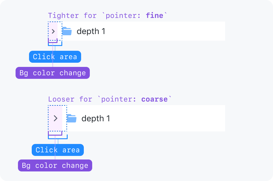
Minimum click target area for the chevron
The chevron has a generous click area to make it an easier target to hit, but it's kept compact to preserve horizontal space in deeply nested nodes.
When we detect that the user is on a device with a coarse pointer, the click target is enlarged.
