Segmented control
Segmented control is used to pick one choice from a linear set of closely related choices, and immediately apply that selection.
On this page
On this page
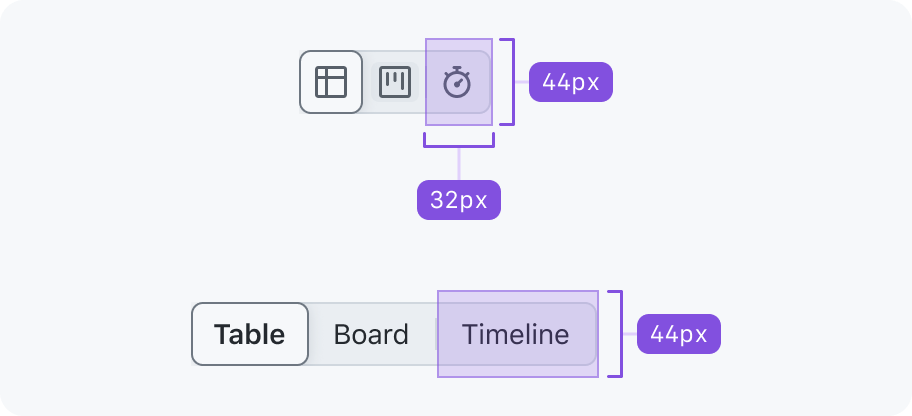
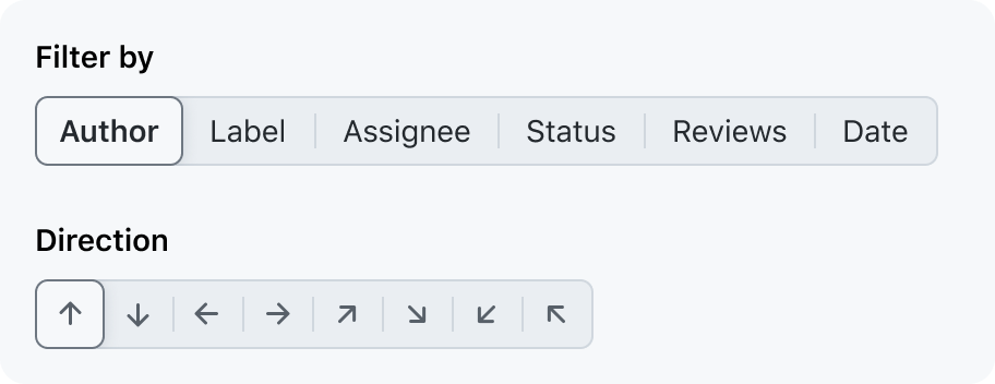
Anatomy

Usage
A segmented control should only be used to change a value; it's similar to a group of radio inputs.
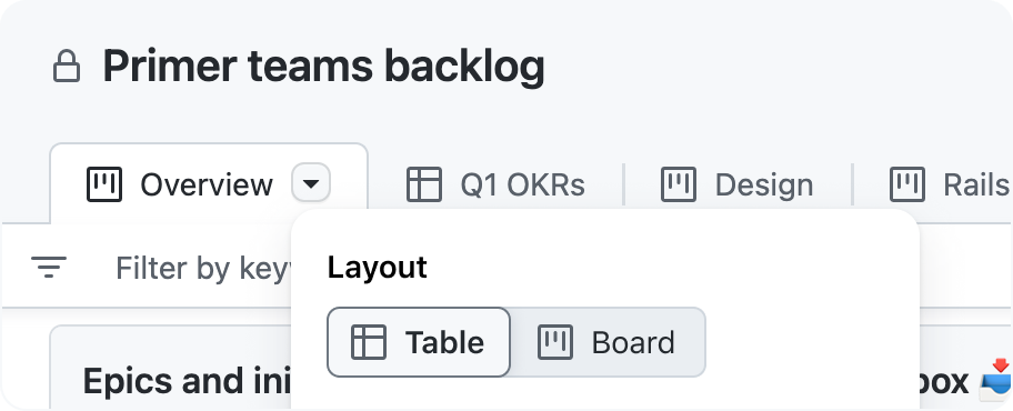
A segmented control should not be used as a form of navigation: use tabs instead. If your primary use case is to hide or show content, that's a good hint that you should reach for tabs or another navigation pattern instead.
Use tabs for navigation or toggling content visibility.
Don't use a segmented control for navigation or toggling content visibility.
Content
Buttons
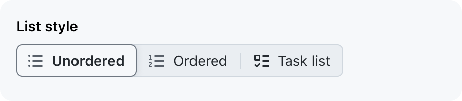
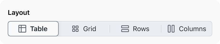
A segmented control should have 2–5 choices with text labels, or up to 6 icon-only buttons. Too many choices can be difficult to parse and take up too much horizontal space. If there are more than 5 choices, use another choice selection pattern such as a group of radio inputs or a dropdown menu.
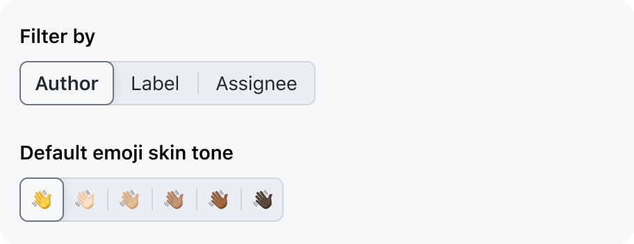
Use a segmented control for picking from 5 (6 for icon-only buttons) or fewer options.
Don't use a segmented control for more than 5 options.
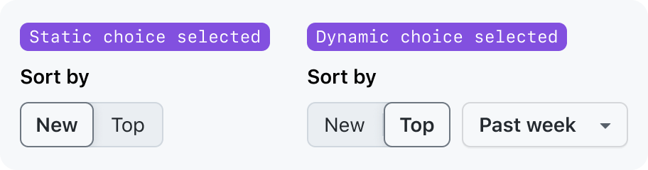
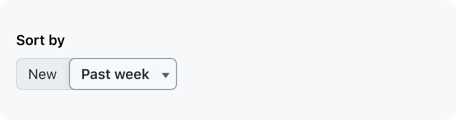
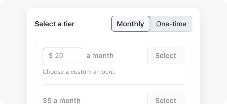
Use a segmented control for selecting from a list of static values. You may use an auxiliary dropdown adjacent to the segmented control.
Don't use a segmented control with a choice that is a dropdown.
Button icons
An icon can be rendered in a segmented control button as a visual cue to help users understand the choice that button represents.
Effective visual cues
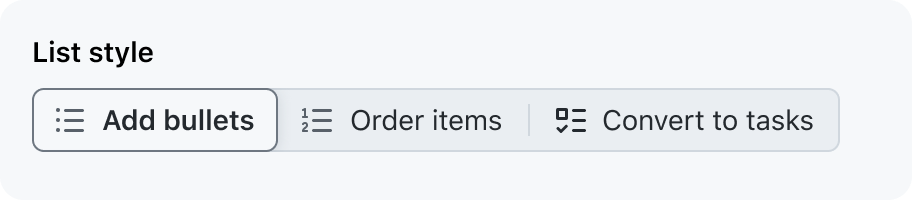
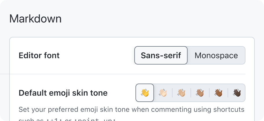
Be consistent with the way visual cues are used in each button of the segmented control. Use either all icons, all text labels, or all text labels with icons.
Do not change icons to communicate state.
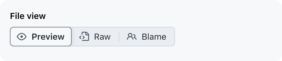
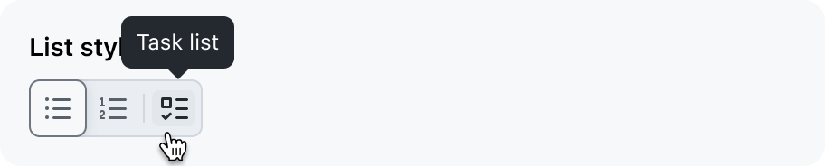
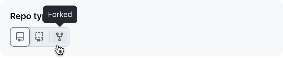
Use icons as a visual cue to communicate what the choice does.
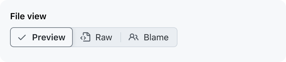
Change or add icons to indicate whether the choice is selected.
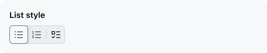
Keep the visual cues in each button consistent.
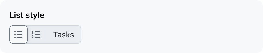
Don't mix visual cues between buttons.
Icon-only buttons
Use icons without a visible text label sparingly, and only with icons that are easily understood by an average GitHub user. When a segment has an icon without a visible text label, the text label should be shown in a tooltip.
Use icons without a visible label when the icon's meaning is obvious.
Don't use obscure icons without a visible label.
Button label text
Segmented control button labels should be nouns or noun phrases that succinctly describe the choice. Button labels may not wrap to multiple lines.
Phrase choice labels as nouns or noun phrases with as few characters as possible.
Phrase choice labels as an action or with unnecessarily long strings of text.
Contextual information
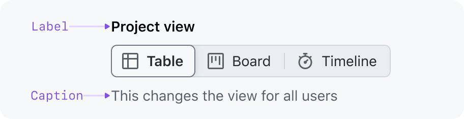
Label
Segmented controls must have a text label, even if the label is only accessible to screen readers. A visible label is the most direct way to identify what the control is used for, but the location and surrounding elements of the control often give enough context to visually hide the label.
Caption
An optional caption may be used to provide additional context to help users make a selection or explain what effect the selection will have. Caption text should be as short as possible.
See the layout section for ways to compose a segmented control with a label.
Interaction
Selections are mutually exclusive. Once a selection has been made, it can only be deselected by making a new selection.
A segmented control does not require a "Save" button to apply the selection. When a choice is selected, the selection immediately affects an object, state, or view.
Layout
Composing the control with a label and caption
Single-column
Single-column
A single-column layout is the same way form controls (for example, text inputs) are layed out. The single-column layout is useful for preserving horizontal space.
A single-column layout is the same way form controls (for example, text inputs) are layed out. The single-column layout is useful for preserving horizontal space.
Two-column
A two-column layout can be used to:
- Align the control with adjacent elements
- Conserve vertical space
- Group related controls in a way that is easy to scan
Fill available width
A segmented control's width can stretch each button evenly to fill the width of the control's parent. This option is intended to make the segmented control easier to adapt into different layouts.
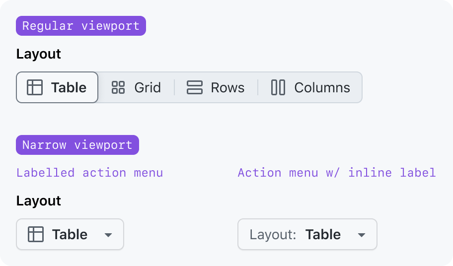
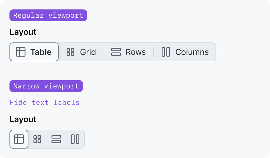
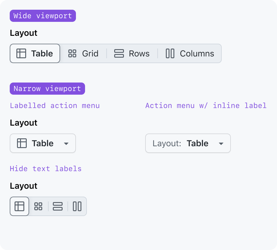
Responsive design
There are cases where a segmented control needs to be placed in a spot that is too narrow to accommodate all of its options. In these cases, the control can be adapted to fit in the narrow area without sacrificing usability.
Convert to an action menu
Swapping out the segmented control for an action menu is especially helpful when:
- The icons cannot be understood without visible text labels
- The control is still too wide when text labels are hidden
Only show icons
If your segmented control uses icons that can be understood without a visible text label, then you can hide the text labels and rely only on icons. The text from the hidden label will still be visible in a tooltip.
Replace the segmented control with an action menu or use icons that are easily understood without text labels.
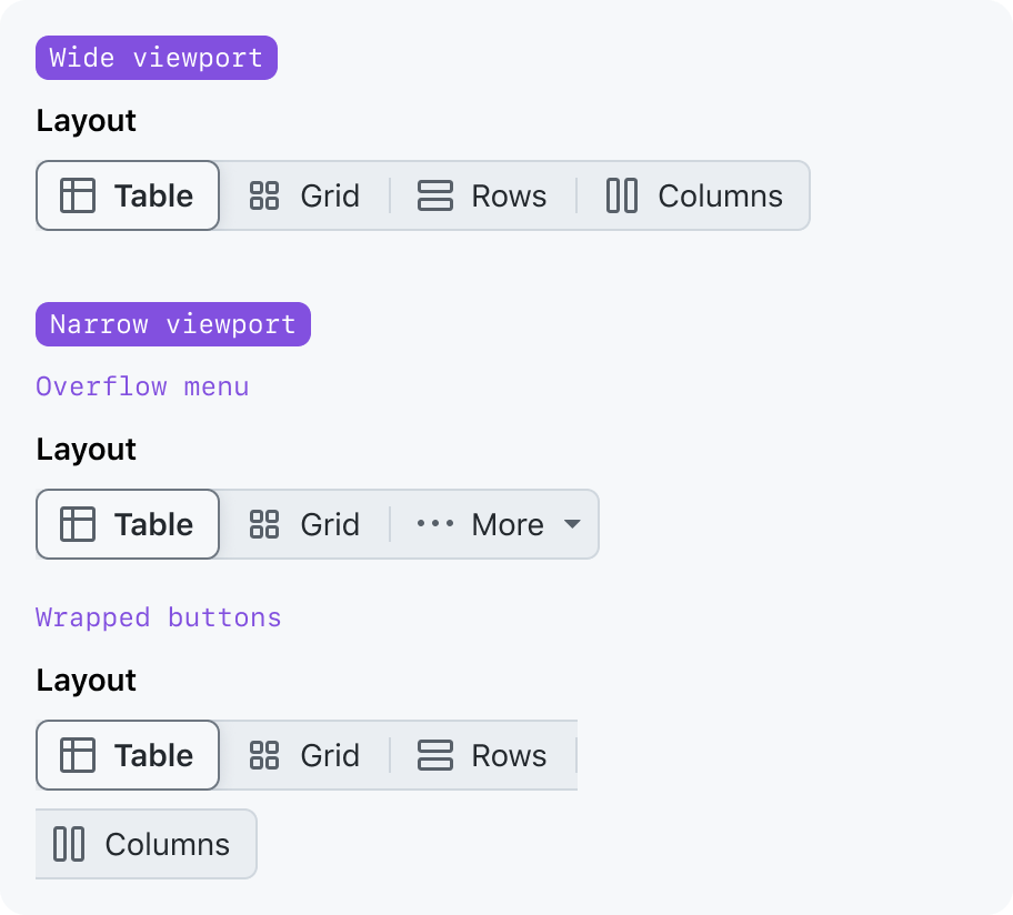
Wrap the buttons to multiple lines, use an overflow button, or remove buttons
Accessibility
A segmented control is treated like a list where each list item contains a button.
Do not treat a segmented control like any of the following ARIA roles:
radiogroup, which would require a save button to apply the changes.tablist, which is used to switch between tab panels of different content.toolbar, which is a collection of function buttons.
These other roles have their own keyboard navigation rules and are treated differently by screen readers and other assistive technologies. Designs that treat segmented controls like tabs or radio buttons would be confusing for users who interact with the web using assistive technologies.
Keyboard navigation
Tab
Tab behaves just like it would in a list of focusable elements.
When tabbing into the segmented control from an adjacent focusable element, the first or last button receives focus.
- Focus will be brought to the first segmented control button if focus is being moved from before the segmented control.
- Focus will be brought to the last segmented control button if focus is being moved from after the segmented control.
Enter or Space
Pressing Enter or Space while focused on a deselected button selects that button. This is the default behavior for buttons.
If the focused button is already selected, pressing Enter or Space should not deselect the button.
Arrow Left or Arrow Right
Unlike radio groups and toolbars, the left and right arrow keys do not change the focus or selection.
Touch targets
Ensure segmented control buttons have a large enough touch target size. On devices that have a pointer with limited accuracy (such as touchscreen phones), provide a larger touch target area. The buttons should respond to hovers, clicks, and taps anywhere in the touch target area, even if it isn't directly on the control.