Filter input
Filter input is an input that provides suggestions through qualifiers and highlights complex filter syntax.
On this page
On this page
Overview
An input that provides suggestions through qualifiers and highlights complex filter syntax.
Anatomy

Content
Icon
A filter input allows free form text searching as well as using qualifiers to narrow down your search. The filter input always supports free form text search. This is why you should use the search icon as a leading visual. A filter icon could give the impression that free form text search isn't available.

Use the search icon in a filter input.

Don't use a filter icon in a filter input.
Submit
There are two ways this component can trigger submission of the input value.
- Auto update results as the value changes (recommended)
- Provide a search button next to the filter input

Auto update results based on when the input value changes.

Don't add an item to submit the current value.
Clear button
The clear button only appears when there is at least one character entered in the input. When the input is empty the clear button disappears again.

Hide the clear button when the input is empty.

Don't show the clear button when the input is empty.
Use an icon instead of a link for clearing the input. This avoids confusion with the value of the input. Especially when the input has a long value that gets close to the clear button a link could be problematic.

Use a circular clear button with an x icon to clear the input.

Don't use a link for clearing as this could be confused with the text inside the input.
Avoid duplication
When introducing custom qualifiers it's important to avoid repetitive icons or descriptions to increase readability and reduce noise for screen readers.
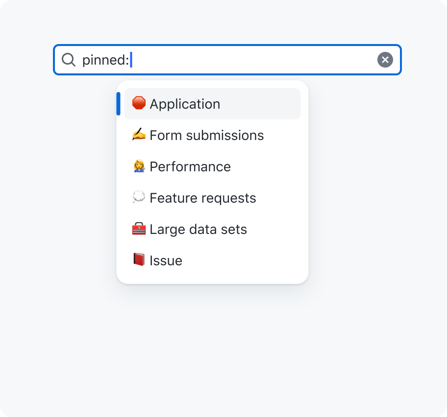
An input with a value 'pinned:' suggesting 'Application', 'Form submissions', 'Performance', 'Feature requests', 'Large data sets' and 'Issues'. All items include a pin board icon and a `Pinned` description.

Don't repeat icons or descriptions that add no additional value.
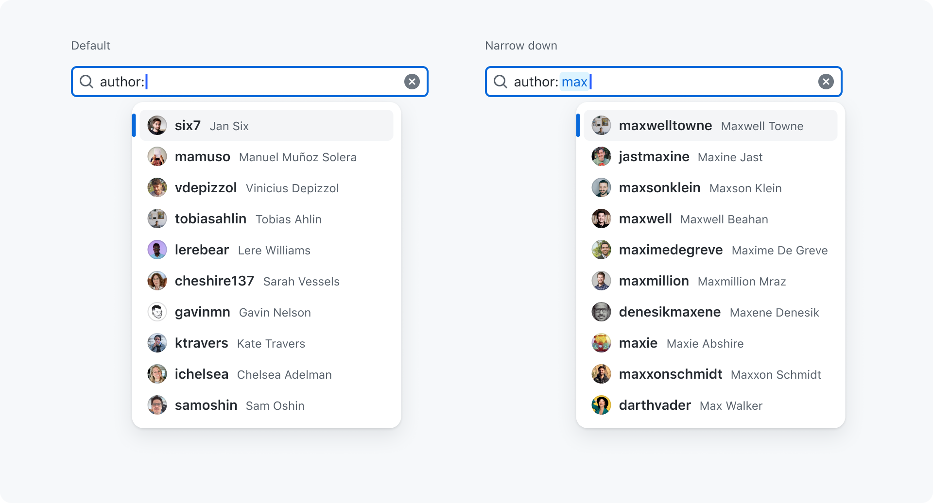
Sorting
There are two different states that should be considered when providing suggestions:
- Default: You've entered a matching qualifier and get default suggestions. For example:
author:. - Narrow down: You've entered a value after your qualifier to narrow down the suggestions. For example:
author:max
We should always strive to provide as relevant results as possible when dealing with user, organization, repository, issue, pull request items. This can be done through a mix of considerations:
- Objects you've interacted with
- Organizations you're part of and it's members
- Repositories you're part of and it's members
- Approximate string matching (fuzzy)
Let's take the author: as an example. While in the default state we aren't searching through the authors and want to provide a default list with users.
It's crucial we make the suggestions as relevant as possible therefore we rank them based on how often/recently you've interacted with them.
Once we start narrowing down those results by using author:max we enter the narrow down state and apply approximate string matching on those suggestions. In this case we still rank users that I've recently interacted with or that are part of my organization/repositories higher.
Not all our infrastructure supports this logic yet. If not available we fall back on alphabetical ordering.
For static items that only return a handful of suggestions we often can just order items through common sense:
Qualifiers
The filter input comes with a list of predefined qualifiers and prestyled suggestions. This ensures everyone aligns on the same qualifiers as well as on the styling of suggestions.

Even though custom qualifiers can be added it's important to check if your new qualifier could fit in one of the predefined qualifiers below.
| Icon | Qualifier | Origin | Suggestions | Format | Preview |
|---|---|---|---|---|---|
| person | assignee | api | avatar, username and Full Name | username | View |
| person | author | api | avatar, username and Full Name | username | View |
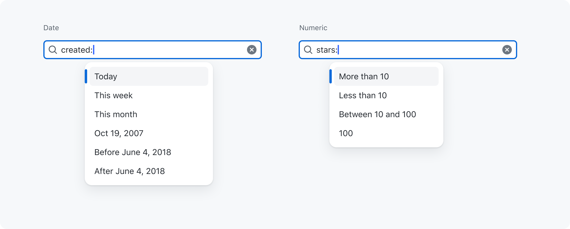
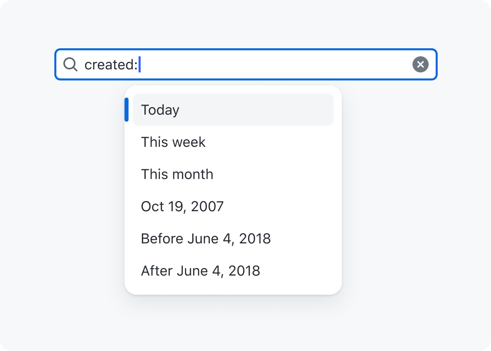
| calendar | created | static | Today, Yesterday, Last 7 days, Last 30 days, Oct 19, 2007, Before June 4, 2018, After June 4, 2018 | @today, @today-1d,@today-1w,>@today-1m, >YYYY-MM-DD, YYYY-MM-DD, YYYY-MM-DD..YYYY-MM-DD | View |
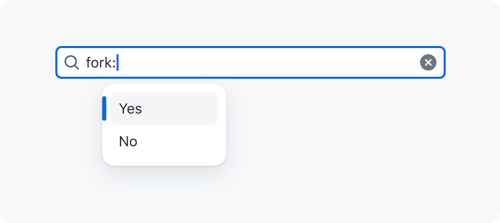
| repo-forked | fork | static | Yes, No | true, false | View |
| apps | is | static | Action, Code, Command, Commit... | name | View |
| tag | label | api | Title, Description and color. | title | View |
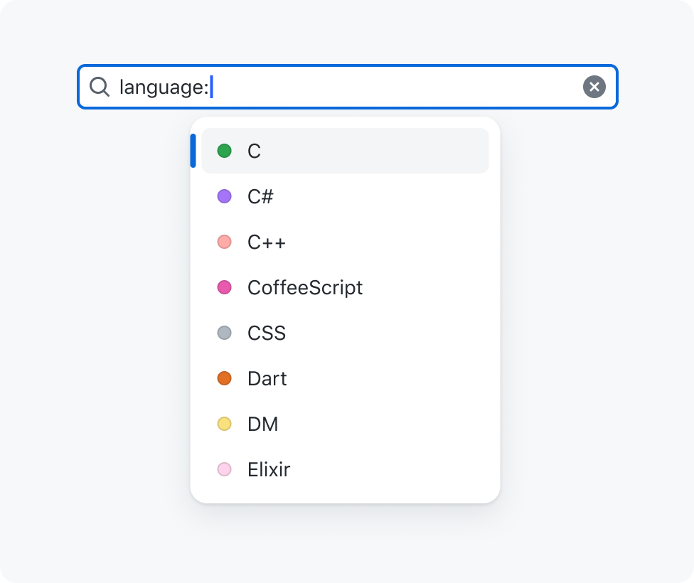
| code | language | static | C, C##, C++, CoffeeScript... | language | View |
| globe | location | static | Amsterdam, Netherlands, Bern, Switzerland... | "Amsterdam, Netherlands" | View |
| file-badge | license | static | BSD Zero Clause License, Academic Free License v3.0... | cc0-1.0 | View |
| mention | mentions | api | avatar, username and Full Name. | username | View |
| organization | org | api | avatar, username and Full Name | username | View |
| repo | repo | api | avatar, username/repo-name | username/repo-name | View |
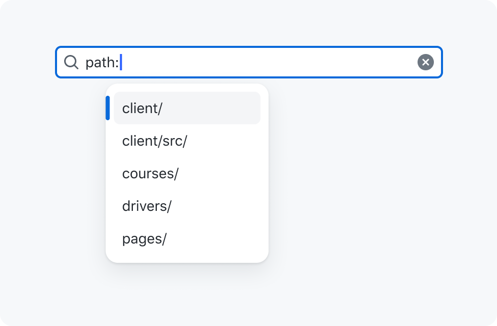
| file-directory | path | api | path | path | View |
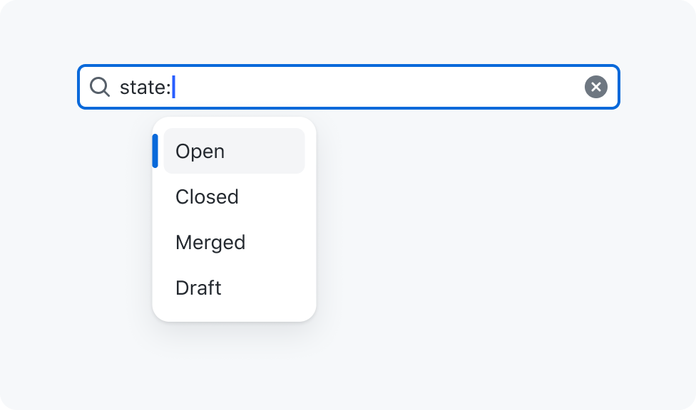
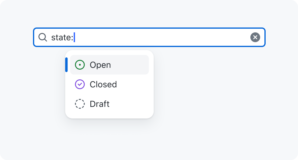
| issue-draft | state (generic) | static | open, merged, closed, draft | open | View |
| git-pull-request-draft | state (pr) | static | open, merged, closed, draft | open | View |
| issue-draft | state (issue) | static | open, closed, draft | open | View |
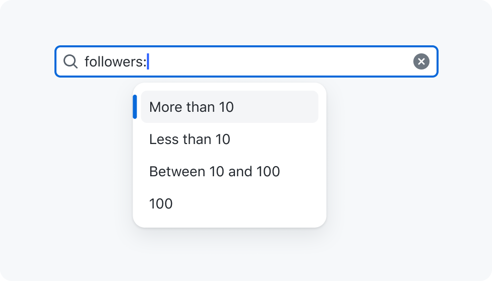
| comment-discussion | comments | static | More than 10, Less than 10, Between 10 and 100, 100, | >100, 10..100, 100 | View |
| people | followers | static | More than 10, Less than 10, Between 10 and 100, 100 | >100, 10..100, 100 | View |
| star | stars | static | More than 10, Less than 10, Between 10 and 100, 100 | >100, 10..100, 100 | View |
| calendar | updated | static | Today, Yesterday, Last 7 days, Last 30 days, Oct 19, 2007, Before June 4, 2018, After June 4, 2018 | @today, @today-1d,@today-1w,>@today-1m, >YYYY-MM-DD, YYYY-MM-DD, YYYY-MM-DD..YYYY-MM-DD | View |
| file-code | extension | static | md, Markdown, json, JavaScript Object Notation... | md | View |
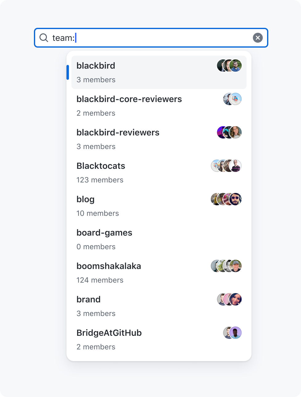
| people | team | api | avatars, name and total members | name | View |
⚠️ This list will change a lot over the next month to accomodate different teams.
Generics
The state: qualifier has multiple variants to improve the experience for specific items:
state: For both pull requests and issues (no icons)state-pr: For only pull requests (with icons)state-issue: For only issues (with icons)
Therefore it's important to use the correct qualifier as soon as you can determine if you're filtering to pull requests or issues.

Use the `state-pr` variant when filtering pull requests.

Don't use the `state` variant when filtering pull requests.
Highlighting
If invalid values are used we don't show highlighting.
While this applies to all qualifiers we do understand that for the ones that depend on our api endpoints (users, repositories, organisations...) we can't always accurately match every result and therefore while not ideal we always highlight those. For example when not single signed-on to a organisation some repositories might not be returned.
Also consider that users might copy paste strings containing qualifiers. In this case you need to run through every qualifier to set the highlight if needed.

Remove highlighting on values when they are invalid.

Don't show highlighting on invalid values.
No matches
When no matches are found we stop suggesting items through the popover and don't show anything.
In rare cases the user could be searching for format:format within the content of items they are filtering to and this will still allow them to do so.

Stop suggesting if no matches are found.

Don't show an empty state when no matches are found.
Values with spaces
Some qualifiers like location: might have values which contain spaces. eg: 'Amsterdam, Netherlands'. In this case we encapsulate the value between straight quotes (not smart quotes).
Without this it would be hard for the parser to understand where the value ends.

Use straight quotes around values with spaces.

Don't use values with spaces without quotes.
Deprecate where possible
There are many qualifiers on our platform that could be unified or deleted. For example type: can now be replaced by is:.
Remember that deprecating means that we stop suggesting those options to users but we still keep them available in the backend until we see usage declining to low volumes.

Use a predefined qualifier where possible.

Use a custom qualifier instead of a predefined one.
Formatting
Always list qualifiers in a readable way and don't include all their options by using descriptions. We do this to ensure that qualifiers are easy to scan and have enough context.

List qualifiers in a readable way and without their options.

Don't list qualifiers as their raw value with possible options.
Dynamic values
Sometimes static values can be limiting when filtering results. For example, let's say you want to get all items created in the past 7 days. Using a static value, you would have to create a range of dates manually, such as 2022-01-01..2023-01-07. However, when you come back the next day (the 8th of January), you would have to update this range manually again to 2022-01-02..2023-01-08. This is not very convenient. That's why dynamic values can be useful in these situations. Using the same example, if you use the dynamic value @today-7d, you will get all items created in the past 7 days. When you come back the next day, the range of dates will automatically update to reflect the current date, so you don't have to do it manually.
| Value | Translation |
|---|---|
@today | Current date (excludes time) |
@me | Current signed in user |
⚠️ At the moment, we are conducting a review of dynamic values with multiple stakeholders, so changes may be made.
Options
Size
Filter inputs can have 3 different sizes:

- Small (
28px) - Medium (
32px) (default) - Large (
40px)