Button
Button is used to initiate actions on a page or form.
On this page
On this page
Usage
Buttons allow users to initiate an action or command when clicked or tapped. The button's label or text description indicates the purpose of the action to the user. At GitHub, buttons are a fundamental building block of our products. Most of the time, we use the "Default" button type, but other types of buttons may be used to indicate something special about the button's hierarchy or functionality.
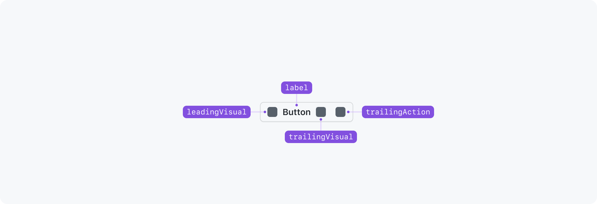
Anatomy
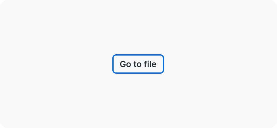
Options
Leading and trailing visuals
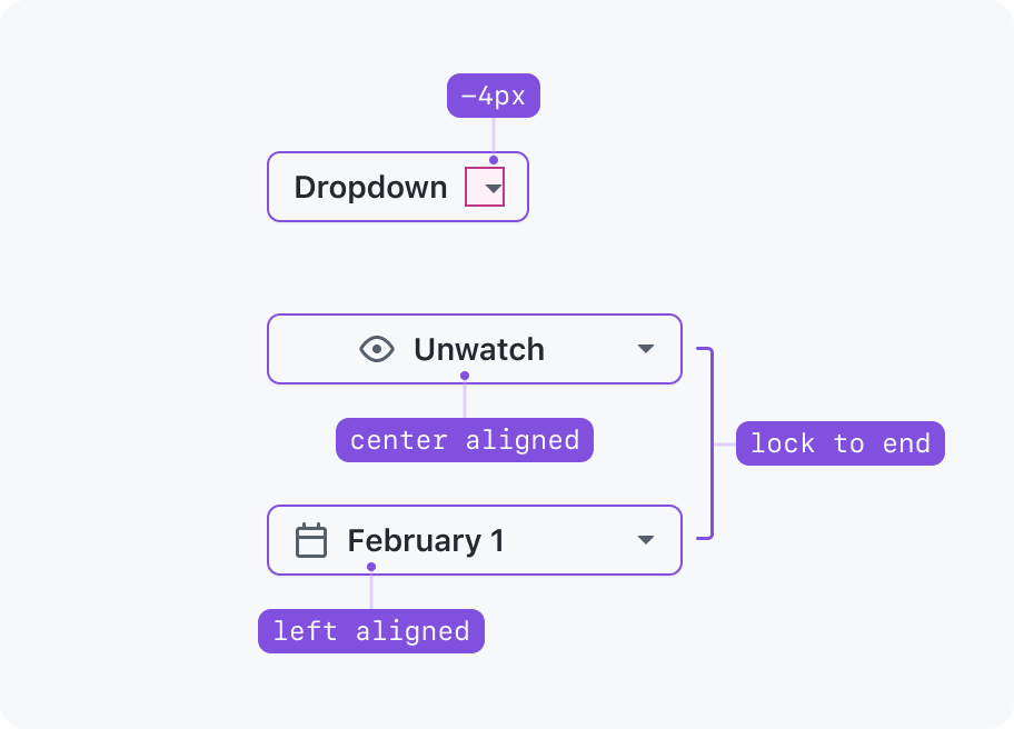
Trailing actions
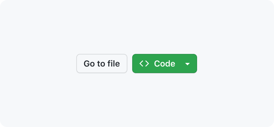
Trailing actions such as dropdown carets are always locked to the end of a button, which is particularly obvious for full width scenarios. If a button is a call-to-action (Submit, Save, Do this™, etc), its contents (visuals and button label) appear center-aligned inside the button container. If a button is used for selecting items (Weeks ▾, Iteration ▾, Sort ▾, Select™ ▾, etc), its contents (visuals and button label) appear left-aligned inside the button container.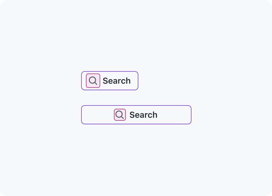
Leading visuals
Leading visuals provide additional context for a button label, such as a “search” icon next to the label for a search field submit. Leading visuals always apear locked to the button label, even if the button is full width.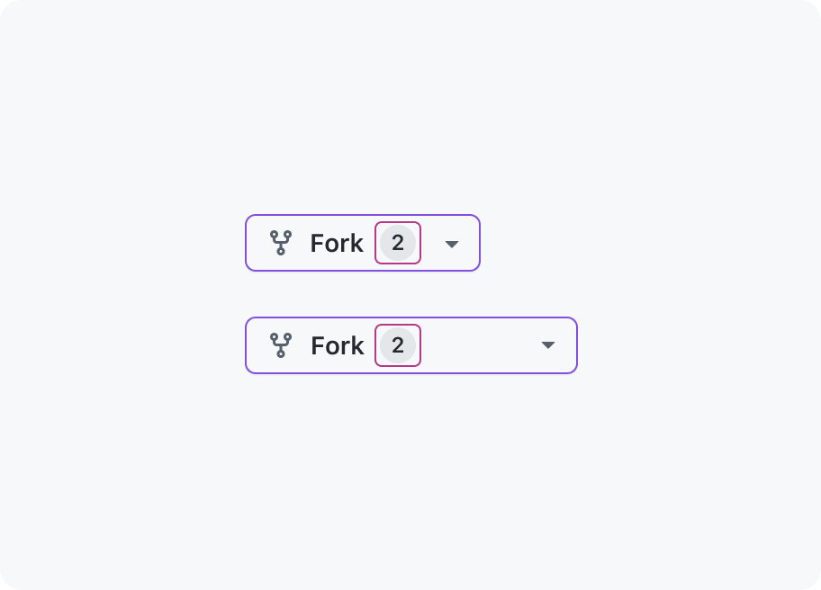
Trailing visuals
Trailing visuals such as counters display additional information about the action or task at hand. Trailing visuals always apear locked to the button label, even if the button is full width.Sizing and spacing
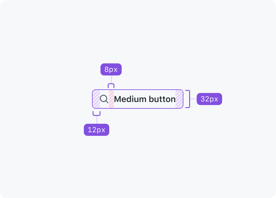
Medium (default)
Primer buttons are medium sized by default. Medium is suitable for most interfaces and is considered the preferred size.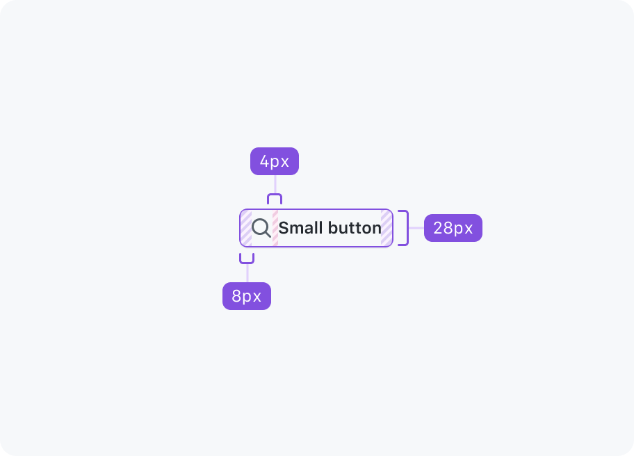
Small
Small buttons may be used when space is limited and if the action is less significant.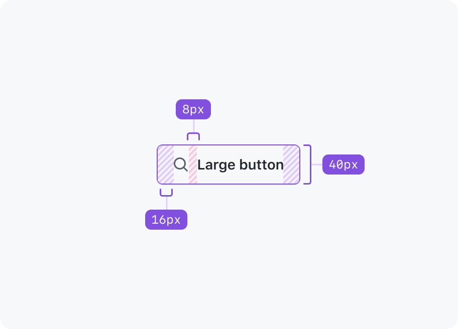
Large
Large buttons increase the significance of an action and should be used sparingly. More often than not a medium sized button will be more appropriate.Color
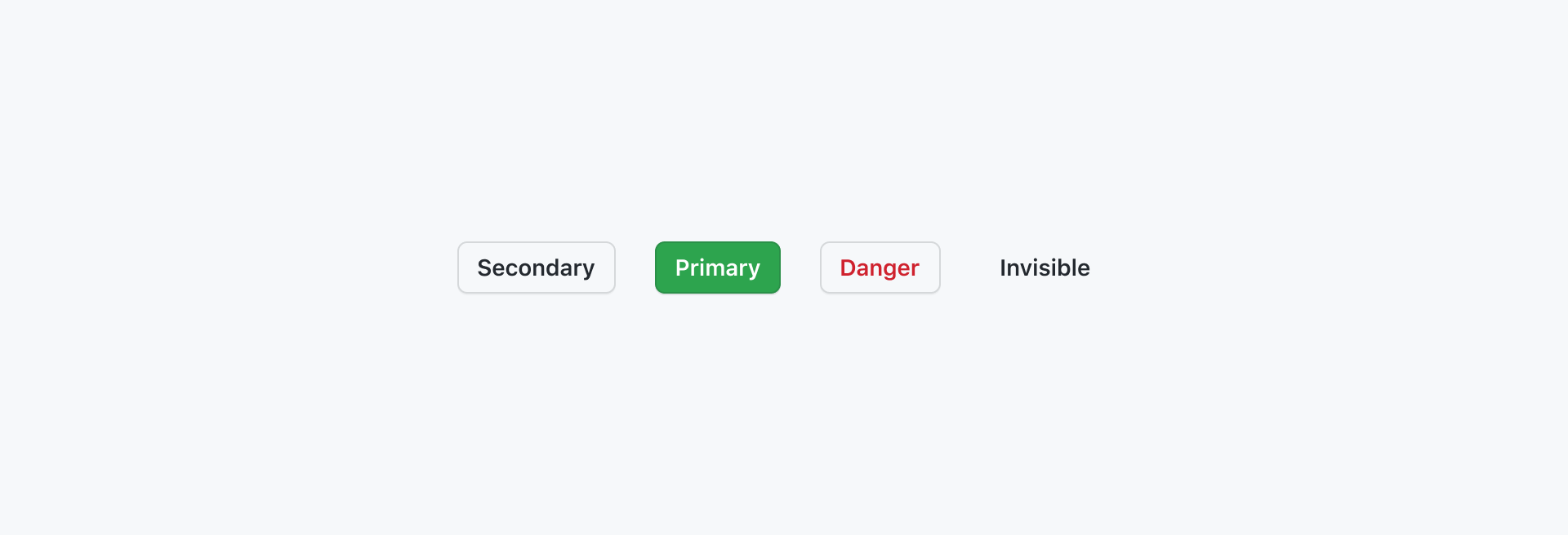
Primary
Primary buttons represent the highest priority action in a page. There should only ever be one primary button (if any) in a button group, and typically only one primary button should be present in page.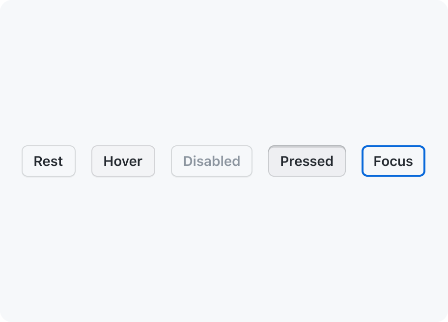
Secondary
Secondary buttons are the default button color scheme and are suitable for more interactions. They can be paired with a primary button to perform a secondary action, or used on their own.
Invisible
Invisible buttons have a transparent background with translucent hover and active states, making them useful for compound components like ActionList.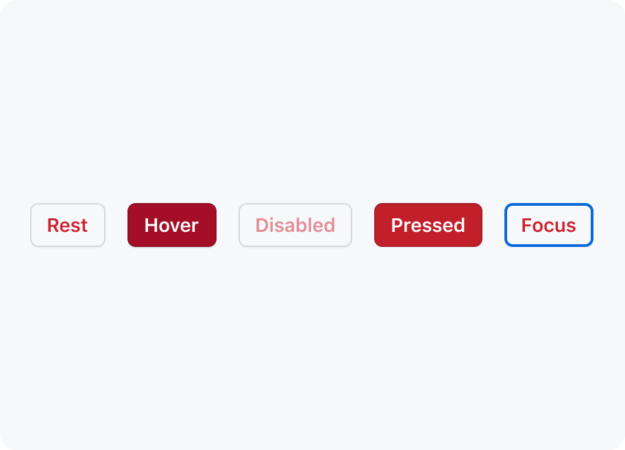
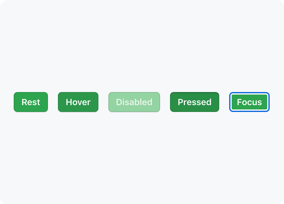
Danger
Danger buttons should be used sparingly to warn of a destructive action, typically resulting in the opening of a confirmation dialog.Best practices
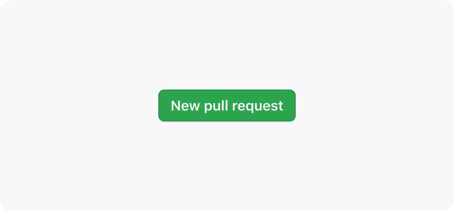
Keep button labels succinct with no line breaks.
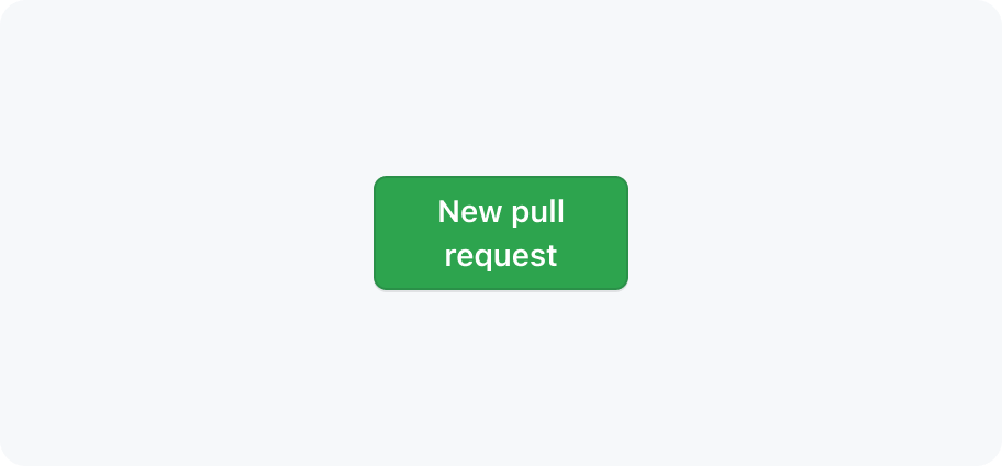
Buttons should never contain line breaks and lose their button shape.
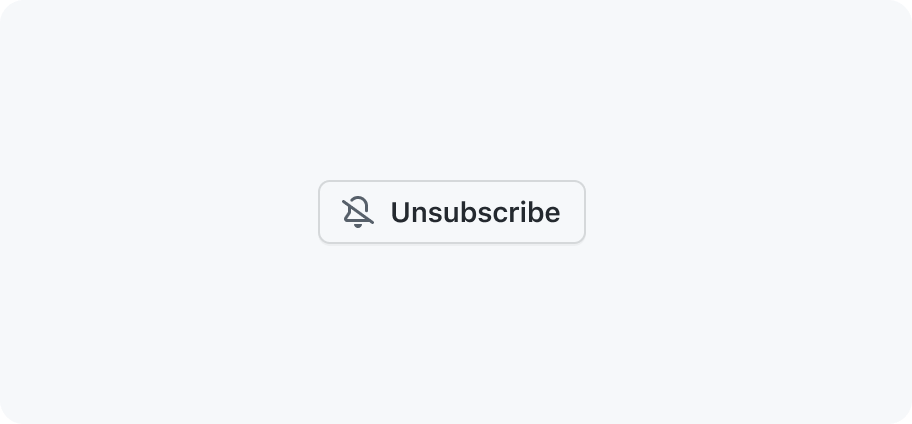
Use sentence case for labels.
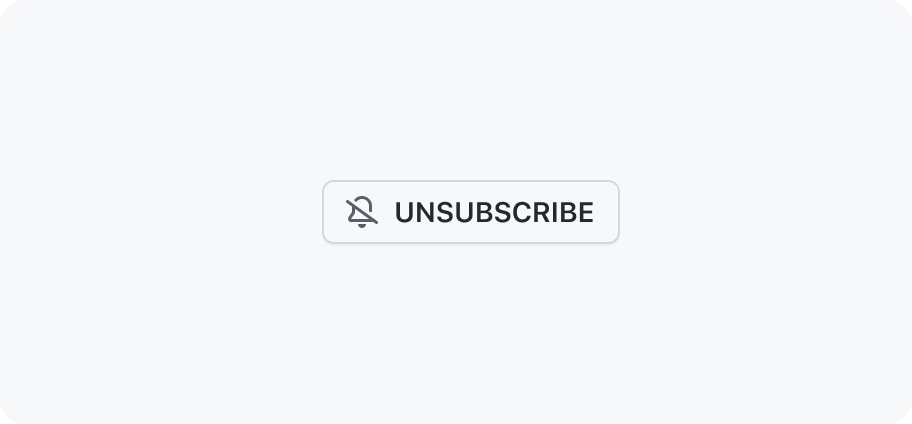
Don't use all-caps or other text formats.
Show focus styles on keyboard :focus
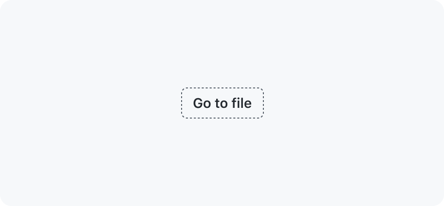
Don't remove default button :focus styles.
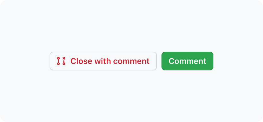
Do place primary buttons at the end of a button group
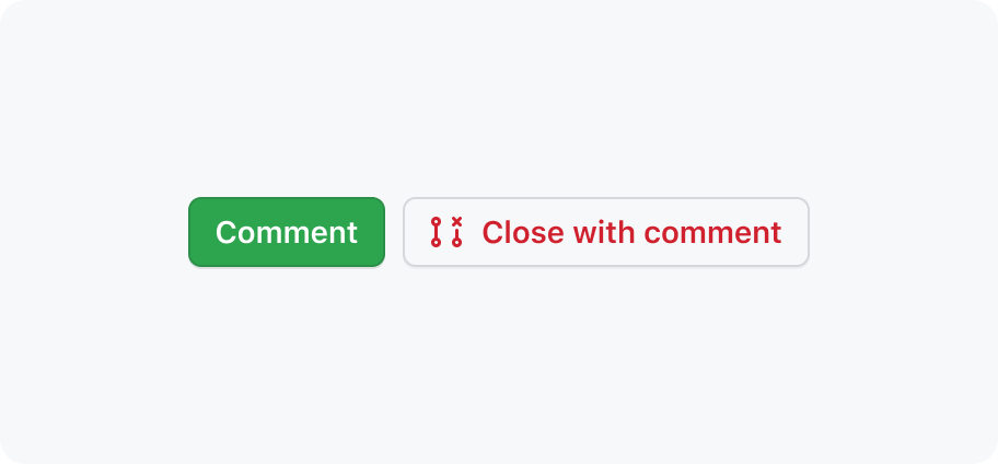
Don't place primary buttons at the start of a button group
Use a primary button with a secondary button
Don’t place multiple primary buttons together
Accessibility
Descriptive buttons
Labeling buttons properly lets users know what will happen when they activate the control, lessens errors, and increases confidence.
Read more about descriptive buttons.