On this page
Button usage
We have standardized buttons documented on Primer CSS and Primer Components, and these docs which serve as the source of truth for development implementation. This article serves to supplement our technical docs with proper guidance on design implementation.
Types
At GitHub, buttons are a fundamental building block of our products. Most of the time, we use the "Default" button type, but other types of buttons may be used to indicate something special about the button's hierarchy or functionality. The following table catalogues a quick glance at how we use buttons at GitHub:
| Type | Visual | Usage |
|---|---|---|
| Default |  | The go-to style to render a button |
| Outline |  | To downplay a button, for navigation buttons, or for filter buttons |
| Primary |  | To emphasize the highest priority action on a view |
| Danger |  | To warn that an action is potentially dangerous or destructive |
| Invisible |  | A subtle style used for actions that are of lower priority in a view's button hierarchy |
Text
Labels
When designing buttons, keep the label as concise as possible. Buttons are to be understood by their type and text. If further clarity is required, consider adding an Octicon or adding a caption.
Use sentence case
Don't use all-caps or other text formats
Captions
In certain scenarios, buttons require supporting text to give the user more context. Use text labels sparingly, as buttons should generally be able to be understood on their own.
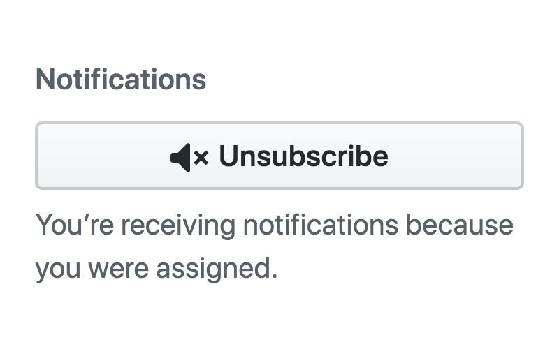
Keep text brief, specific, and descriptive
Don't use unnecessary, redundant text descriptions
Sizes
| Size | Usage |
|---|---|
| Medium | The default button size |
| Small | Decrease button size when space is limited and the action is of lesser significance. |
| Large | Increase button size to bring prominence to buttons that have major impact. Use large buttons sparingly, as layouts should generally have only one large button. |
Alignments
Order
When a secondary button is placed in conjunction with a primary button, the primary button should always be placed on the outermost alignment, or on top and extended full-width if stacked.
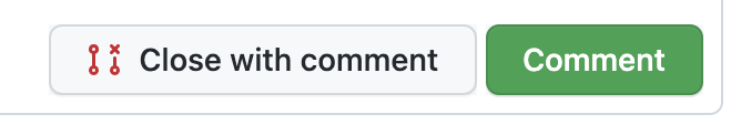
Follow this principle to align your buttons accordingly
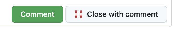
Don't ignore this principle and misalign primary buttons
Full-width
In certain scenarios, it may make sense to use full-width buttons that extend to the width of their container. Use this style sparingly, but some appropriate use-cases include:
- Modals with a singular call-to-action
- Responsive behavior of buttons when scaled down
Use this pattern to confirm important actions
Don't misuse this modifier by extending buttons full-width unnecessarily
Icons
Use Octicons in conjunction with buttons to clarify an action if text alone is not enough to explain its functionality.
In some cases, Octicons are used to create an identifiable visual indicator for a common action or paradigm. For example, the repo icon is used next to repo links, the new repo button, and repeated in the new repo flow. This repetition and continuity helps people learn and identify our visual language.
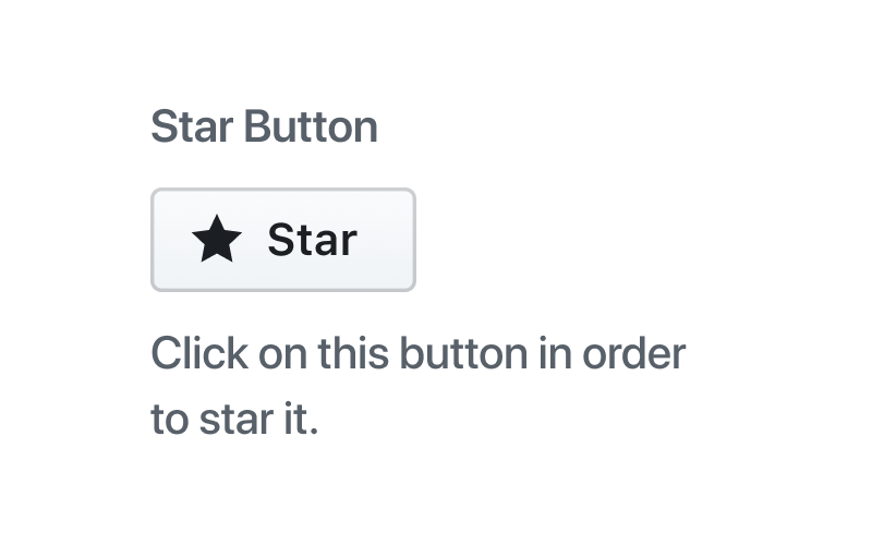
Icon with label
Most of the time, a button will have an icon and a label for clarity.

Icon only
In some cases, an action can be understood with using just an icon. Icon-only buttons can help save space in a cramped area.
Buttons that only use an icon should still have a label that is invisible to sighted users, but accessible to assistive technology (for example: read aloud by a screenreader).

Counters
Counters can be added in appropriate scenarios to provide context. For example, showing social proof by displaying the number of people watching a repo.
Counter inside button
A count can be displayed inside of a button using a CounterLabel.

Counter attached to a button
A count can be displayed as a separate element that is attached to a button. Only display a count as separate element that is attached to a button when the button uses the "small" size variant and the button type is "Default" or "Outline".

Dropdown triggers
Button that toggles a dropdown
When a button is used to toggle a dropdown, it should have a visual cue to help users understand the functionality.

Button with action variants
Group a button with a dropdown button in instances where a primary action allows for variants on the primary action. For example, there are different merge strategies a user can choose from when merging a pull request.

Groups
Use button groups to organize similar functionality. Only "Default" and "Outline" button types can be used in button groups. This modifier can also be used as a filtering pattern.

Group buttons with closely related functionality

Group buttons just because they're close together
Best practices
Limit primary button usage
Only use one primary button on the page, whenever possible, to indicate its emphasis relative to other actions. Primary buttons have top priority in visual hierarchy, and using too many of them on a single view dilutes their effectiveness.
Use outline buttons independently
Outline buttons are mainly used for secondary actions such as filtering. Don't use in conjunction or place in close proximity of other button styles
Support
Requesting feedback
If you have any questions while implementing buttons, or are looking for feedback, please reach out to the #primer channel on Slack.